 This week I head back to teaching 2nd Year Animation Character Design at Sheridan College here in Ontario. As John Kricfalusi has just posted this very informative article regarding character design on his blog, I thought I might tie into what he is saying once again. This post deals with what John describes as the "Functional" aspect of the design process - just understanding how simple forms placed together in an appealing manner is the foundation that an animator/cartoonist starts out with initially.
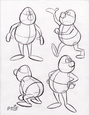
 These drawings posted below are fairly simple, as they were done not for Sheridan students, but rather, for a more basic cartooning class I have taught informally at a couple local venues over the last several years. As such, they are not as "animated" as I usually prefer to draw, lacking a feel of "Squash and Stretch" that would give them more of an organic, pliable quality. But they serve the purpose of showing the concept of how to draw a simple constructed character in a variety of poses while maintaining consistency of form and proportion. Remember, this particular cartooning class included several students who were just beginners!
 Here are the simple constructed forms, with guidelines to determine the tilt and angle of the head and body, as well as for consistent placement of all of the surface details. Though pictured in black line here for clarity, it is recommended you draw this stage lightly with a blue pencil in order to distinguish it from the finished outline and details you will be adding on top later.
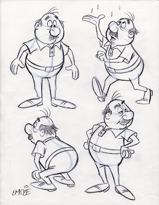
 Here is the finished character with all surface details added, and the light blue underdrawing still slightly visible so that you can see how it is done. As you can now see, those guidelines have helped in the accurate placement of his facial features, as well as the collar of his shirt and belt line too. Also notice how I've varied his expression and eye direction in order to create some personality and more visual interest. When drawing different tilts and angles of the forms, you also have to understand some of the basic rules of perspective in order to give the illusion of a solid form rotating in space while maintaining a consistent volume. Again, as John always tells beginning cartoonists, it's a good idea to learn what you can from the Preston Blair book, as that's quite honestly how most of we professionals learned in the beginning, back when we were young! Artistic styles may change over the years, but the fundamentals of good solid drawing do not.
PS: I dedicate today's post to young Chet, who was looking for some advice on how to construct a cartoon character. I hope this helps him out a bit.