Showing posts with label John Kricfalusi. Show all posts

Tuesday, March 8, 2011

Continuing On From Last Lesson...

I'm still referring back to this post that John K. had on his blog last week that I expanded upon in my last post. I think there's a lot of good stuff in there that I'm sort of taking on as a personal challenge to see what I can come up with based on John's ideas on character design.

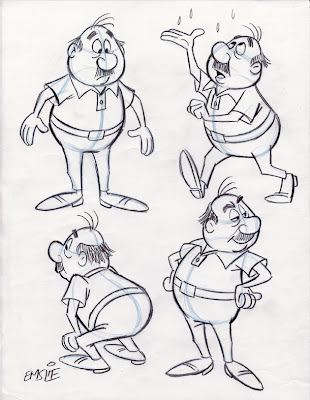
The little guy that I had drawn as a demonstration of simple cartoon construction in my last post is appealing enough I suppose, but his structure is limited to very basic spherical shapes: slightly distorted egg shapes for both his head and body. As I had mentioned, it was for a beginners' cartoon class, so that's why I kept it as simple to follow as I could, but it is admittedly a bit boring. My own personal taste dictates that there be more of a feeling of animation, especially the principle of "Squash and Stretch" that gives a character a more pliable and "organic" quality. On a chubby little guy like this particularly, it's good to imbue him with a feeling of loose flesh that reacts in actions and expressions. Additionally, I am trying to explore other design possibilities, which John covers as "Aesthetic", where you try to make the design more visually appealing by varying the types of lines and shapes, as well as relative lengths and widths of the many elements within the figure. So, in the case of this little guy, I tried distorting those original egg shapes, adding some straight planes and what we call 'S' curves to break up the monotony of what it had looked like before.

Along with this visual experimenting, I am also at this stage thinking of what sort of "Personality" type he might be, again going back to John's thoughts on what should be considered when creating a character design. In the original design, he was looking like a bit of a curmudgeon, sort of a similar type to Mr. Wilson in Hank Ketcham's "Dennis the Menace". In these new sketches I am trying different personalities on him, deciding whether I might want him to be worn out and tired, pompous and aloof, or a bit more silly and carefree. Well, here's where the sketches start to suggest something more specific...

The sketch on the righthand side of the exploratory concepts page recalled a guy I used to work with years ago named George. Just like the rough sketch, George always had a big easygoing smile, with an upper lip and mustache that jutted out above a lower lip that was swept back with a receding chin. He was a really funny and delightful guy, so I thought I would base my character on his personality and physical traits, though this is not meant to be a perfect likeness of him, but rather, just using George as a starting point for developing this guy in a specific direction.

The veteran Disney animator, Eric Larson, often noted how he based the persona of Figaro, the kitten in "Pinocchio", on that of his own little nephew. This little kid could be stubborn and prone to temper tantrums, so Eric imbued his character with similar mannerisms, resulting in a character "type" that the audience would likely be familiar with and thus could easily relate to. This approach of basing characters on either one or a combination of several people you've actually met in your life experiences can result in richer animated performances and designs that really communicate a specific idea, rather than just trying to invent something randomly from scratch.

So, in developing this character based on my old friend George, I tried to recall specific instances from when we worked together. One thing I remembered was how George used to enjoy going out for the occasional game of golf which was compliments of one of our longtime vendors in appreciation for the work thrown his way during the year. By George's own admission, he was a lousy golfer himself, but he was mostly looking forward to the free meal he'd get back at the clubhouse dining room! George was a wheeler-dealer who loved to barter for things rather than pay good money, therefore a free lunch was never turned down. Another fond recollection I have of George is his impromptu, hip-shakin' Elvis impersonations. Again, that's something colourful and fun that can be utilized in the traits of this character design. By the way, George may have had a middle aged paunch, but he was not as hefty as this character, so that is still a direct holdover from the original concept. This character could be taken further, exploring more visual possibilities before refining it into a final design, but since this is just for the sake of this demo, I'm going to leave it there.

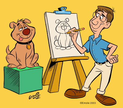
Lastly, here is a page of rough poses I did of this dumb mutt many years ago. You'll note that this pooch ended up as my life model in the cartoon heading up my last post. Fortunately, the black eye he'd likely acquired in a doggy rumble seems to have healed up nicely since the rough sketch.
Cartoon Construction 101

This week I head back to teaching 2nd Year Animation Character Design at Sheridan College here in Ontario. As John Kricfalusi has just posted this very informative article regarding character design on his blog, I thought I might tie into what he is saying once again. This post deals with what John describes as the "Functional" aspect of the design process - just understanding how simple forms placed together in an appealing manner is the foundation that an animator/cartoonist starts out with initially.

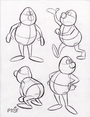
These drawings posted below are fairly simple, as they were done not for Sheridan students, but rather, for a more basic cartooning class I have taught informally at a couple local venues over the last several years. As such, they are not as "animated" as I usually prefer to draw, lacking a feel of "Squash and Stretch" that would give them more of an organic, pliable quality. But they serve the purpose of showing the concept of how to draw a simple constructed character in a variety of poses while maintaining consistency of form and proportion. Remember, this particular cartooning class included several students who were just beginners!

Here are the simple constructed forms, with guidelines to determine the tilt and angle of the head and body, as well as for consistent placement of all of the surface details. Though pictured in black line here for clarity, it is recommended you draw this stage lightly with a blue pencil in order to distinguish it from the finished outline and details you will be adding on top later.

Here is the finished character with all surface details added, and the light blue underdrawing still slightly visible so that you can see how it is done. As you can now see, those guidelines have helped in the accurate placement of his facial features, as well as the collar of his shirt and belt line too. Also notice how I've varied his expression and eye direction in order to create some personality and more visual interest. When drawing different tilts and angles of the forms, you also have to understand some of the basic rules of perspective in order to give the illusion of a solid form rotating in space while maintaining a consistent volume. Again, as John always tells beginning cartoonists, it's a good idea to learn what you can from the Preston Blair book, as that's quite honestly how most of we professionals learned in the beginning, back when we were young! Artistic styles may change over the years, but the fundamentals of good solid drawing do not.

PS: I dedicate today's post to young Chet, who was looking for some advice on how to construct a cartoon character. I hope this helps him out a bit.

"Bland" Be Banned!

John Kricfalusi has another provocative topic regarding "bland" character designs that can be found in this recent post. For the record, though I admire John's knowledge of Hollywood cartoons greatly, I often respectfully disagree with his stance on the characters and stories in the Disney features, as I find he's too dismissive of a lot of wonderful art. However, I do see his point this time around in regards to the way kids are often designed in the Disney films. I'll admit there is a generic template that Disney has adhered to in many of their kid characters, with only minor variations in the facial types.

John has posted a bunch of photos of famous Hollywood kids from live-action films of that bygone era, which he rightly acknowledges as having more personality traits and physical variation than their animated film counterparts. Just for fun, I've decided to draw some quick caricatures of 6 of his photo examples in an attempt to show how these particular kids could be adapted as animatible cartoon characters, with an eye to exploring different head shapes and facial features to show distinction of character "types", as well as unique and interesting silhouettes. The likenesses are only so-so, by the way. What I'm really trying to do here is show how a character designer could start with photo reference of a specific "type" as a jumping off point to creating a design that communicates that particular personality to the audience. So here they are:


1) Beaver Cleaver - The All-American Boy: I've also added a baseball cap to this likeness to exaggerate his distinction as the cleancut kid that would make his Mom proud, despite his propensity to get into typical boyhood dilemmas. Physically, the Beav has downward sloping eyes, buck teeth, and a square face. His facial features suggest a trusting look that communicates his naivete and basic goodness.

2) Bobby Driscoll - The Mischievous Imp: Bobby has pixie-like features in his slanted up twinkling eyes, small pug nose, and devilish grin. His face shape and placement of features are a series of 'V' shapes. You just know this kid is up to some youthful prank, but you can't help but like him. In his teenage years, Bobby of course was the voice and model for Disney's "Peter Pan". Here then is where I would disagree with John's assessment in a previous post of Pan as being "generic" in design. Pan was a deliberate caricature of Bobby Driscoll and is therefore quite a "specific" type in my opinion.

3) Will Robinson - The Inquisitive Whiz Kid: His long face, vertically stretched facial design, and slight build suggest a kid that would rather read books and build model kits than go out and play sports. He is the typical "Brainiac", quite fluent in math and handy on the computer.

4) Alfalfa - The Gangly Casanova: He of course was the oddball, awkward looking stringbean among "The Little Rascals", with his stretched out, skinny physical build, big expressive eyes, and that cowlick that shot straight up like an antenna. Yet despite his physical ungainliness, he fancied himself a "Lady's Man", always ready to serenade some young cutie with his off-key singing. I'd suggest that Disney's "Ichabod Crane" is the adult equivalent of this character type.

5) Opie Taylor - The Bumpkin: With his goofy gap-toothed smile, tussled "Sheep Dog" red hair, and a generous helping of freckles, Opie is the kid that's just made for running barefoot through a pasture, climbing trees, and gnawing on a big slice of watermelon. No big city living for this small town boy.

6) Danny Partridge - The Conniving Schemer - (I had to find a different photo to work from to draw this guy) His face is wider horizontally than the others and his narrow, shifty eyes also follow across that side to side facial pattern. His mod, uncombed 70's era long hair communicates that "Rock Star" self-assured sleaziness. You know by looking at him that he's up to no good, trying to make a fast buck by hustling some poor unsuspecting schlemiel.

These drawings are by no means the only ways to portray these distinctively different kid "types". There are so many varied approaches one could take to accomplish the same goal. The key, though, is making a concerted effort to study real faces of kids in order to come up with more "specific" characters as John K is always trying to encourage. Otherwise, by just designing something out of your head with no research, you're likely to end up with the same "bland" or "generic" character designs that we've seen in countless animated features and TV shows. As my Sheridan Character Design students soon become aware of each year, I insist on them keeping a sketchpad and using it to record all of the wonderful array of character types they see all around them. Also, I prefer that they take a more "caricatured" approach to drawing people, as this is the best way to develop unique and interesting personality types through humourous exaggeration and visual shorthand. Again, I'd like to thank John Kricfalusi for this interesting topic as a springboard for me to expand on the theme here on my blog.

Monday, March 7, 2011

AWESOMENESS!!! Well, not really...

Pen: "WOW!!! Look, there are butterflies playing volleyball in my Cheerios. AWESOME!! C'mon guys, let's hop on my coolio cosmic magnetocycle and head on over to Jake's pad-eroonie!"

Pen: (Moments later) "Hey Jake, my main dog, what's hanging?"

Jake: "Well, I was contemplating the state of wormholes in the seventh dimension, but I guess I'm free to accompany you on your journey to the planet of perpetual platitudes as soon as I can locate my cybermuzzle. Oh look - bunnies!"

Pen: "BAROMETRIC!!!......Let's go, Jake - It's ADVENTURE TIME!!"


So, what do you all think of what I've just written there? Quite the brilliant piece of dialogue, don't you think? What's that you say? You think it's stupid and makes no sense? Hmmmm....

Well, that makes two of us then, as I agree that it IS stupid and it DOESN'T make sense. But I have to tell you, if what I'd just written was a portion of an actual script from "Adventure Time", then I'd apparently be hailed as a genius by many of the current readers of Cartoon Brew. Take a look here to see what I mean. And here is "Adventure Time" itself, courtesy of YouTube:


It seems that the so-called Cartoon Network has picked up this insipid little time waster to produce as a regular series. Yet that's just fine with the Cartoon Brew's Amid Amidi, who lately seems to champion anything he perceives as being fresh and different, even when it's plainly devoid of any real writing or art talent. He's also real gung ho for this nasty, ugly thing, so I'm afraid I just don't share his taste in some new animated TV series. Yes, I know I'm being blunt in my negative assessment of this show, but I think it's time that some of us take a stand against mediocrity or it will continue to take over all areas of the entertainment world, squeezing out anything of any real artistic merit in it's wake. Here are just some of the things that are wrong with "Adventure Time":

- The script, such as it is, sacrifices linear storytelling in favour of stringing together non sequiturs, hoping like hell that the audience doesn't notice the absence of a coherent plot. As I just proved with my example at the top of this post, there is nothing difficult or clever about this sort of writing - it's just stream of conscious randomness masquerading as dialogue, not being driven either by plot or development of character. Some may call it "quirky". I call it the work of a hack.

- The character designs are not really "characters" at all - not in the truest sense anyway. Like so much of the mediocrity in contemporary animation, there seems to be a trend toward child-like minimalism in the drawing: Amorphous head shapes with nothing more than dots and dashes representing the eyes and mouth, formless outlines in lieu of real structure or appealing distinct shapes, and no regard for trying to communicate feeling through body language and facial expression. As such, all of the characters' thoughts and emotions are carried completely by the dialogue, which itself is meaningless to begin with. As a test, try watching the clip with the sound turned off, as you'll see that the visuals completely fail to communicate anything on their own. This is a cardinal sin in animation, as the communicating of an idea should be possible through the visuals alone, with the dialogue remaining secondary.

- Even the layouts are really bad. There is poor composition as evidenced by the tree that seems to grow out of the boy's head in the opening scene. Also in that same scene, the dog's head keeps hitting the horizon line as he bobs up and down. Students of animation are told to avoid drawing tangents like this, and are instead instructed to break past such a border so that it is clear that one thing exists in front of another. Much of the layout composition is sloppy and uninspired throughout the entire clip.

- Then you have the garish colours so typical in today's computer coloured animated shows. No skilled background painter would ever choose to paint the grass in that "Lite Brite" neon green, yet so many show creators today seem to believe that the brighter and gaudier the better. I applaud John Kricfalusi for continuing to decry this trend as he has often pointed out deplorable uses of colour in modern cartoons, while showing examples of inspired and harmonious colour schemes in the TV cartoons of the past. Here is a compilation of his writings regarding background painting that provides numerous examples of both good and bad colour for comparison.

In short, this sample from "Adventure Time" flies in the face of every time honoured artistic principle that exists, both in terms of the visual artwork and the writing. But, judging from the "awesome" accolades found in the Brew post's comments section, many of the Brew readers just refuse to see its severe shortcomings and have hailed it as a masterpiece. Not all readers are so gullible, however, and I applaud freethinkers like Jason, Brooke, and Eric for not drinking the Kool-Aid. We need more discerning viewers like them.

By the way, "Adventure Time" also strikes me as being an inferior derivative of TerryToons' "Tom Terrific". Watch this clip and you'll see how this cartoon, while also very simple in its visual design, is just so much better in terms of real cartooning, with sprightly posed characters and expressions that communicate:

Sunday, March 6, 2011

Anthropomorphism

John Kricfalusi has just posted an interesting piece on the use of dog-nosed faces on otherwise very human cartoon characters. This is a phenomenon mostly found in Disney's "Uncle Scrooge" and Donald Duck" comics illustrated by Carl Barks, although it's been seen in animation as well, like Nelvana's "Rock and Rule", for example. I agree with John that this type of character is rather off-putting, as it is neither distinctly human nor typical of the "Funny Animal" type of cartoons so prevalent in animation and comics. Though the Carl Barks dog-nosed characters are rather benign, this trend also begat the "Furry" movement, which usually also seems to have a sexual bent to it in the art of its many practitioners.


At this very point in time, I am coincidentally covering the topic of "Anthropomorphism" in my Character Design course at Sheridan College, so I'd like to take this opportunity to address the distinction between "Funny Animals" and "Furries". Some time ago, I'd posted this piece on "Four Degrees of Anthropomorphism" that covers most of the main approaches to creating animals with human traits and personalities in various animated shorts and features. By breaking it down into these four common approaches, I hope to teach my students how to create a set of rules to apply to the way they handle animal characters in their film stories, so that there's a certain logic and plausibility that is maintained in what they're trying to communicate to their audience. And from a purely visual standpoint, I'm also trying to impress upon them where to draw the line between an anthropomorphic animal that possesses human traits, before crossing that line and instead ending up with a "Furry", being essentially an animal's head stuck on top of a fur covered human body.


Ideally, an anthropomorphic animal should maintain something of the actual animal's physique, even when walking around on two legs and wearing clothes. If you look at this still from Disney's "Robin Hood", you will note that Robin himself is still very much a fox on two legs, and that if placed back down on all fours without his costume, he would be very much at home in a film like "Lady and the Tramp" as a caricature of a real fox but with a human personality. Same thing with Little John the bear. When done really well, an anthropomorphic animal character should be initially visualized as a "Human Type", then translating those human physical traits and reinterpreting them in the animal design. I discussed this topic here.


For those of you familiar with "The Country Bear Jamboree" at Walt Disney World, the Disney artists were very successful in creating a cast of bear characters that looked like caricatures of the type of performers one would see on the stage at Nashville's "Grand Ol' Opry". Here is a picture of "Big Al", as an example of what I'm talking about. The facial design and physical body type are very much based on the character's human equivalent, yet never losing sight of the physical design of the actual animal either. For many students, this seems to be rather confusing and a challenge to pull off, while for others it seems to be a very natural, intuitive process.


For the uninitiated, just so you have a clear idea of the distinction between what I'm describing here and the aforementioned, dreaded "Furries", here is a link to some Google images of the latter. As you can see, they are more mutant than animal. As a general rule of thumb: If it is embarrassing to look at your animal character when he or she is naked, chances are you've drawn a "Furry"!!


Just to solidify the distinction, here is a clip from Disney's "Bedknobs and Broomsticks" that shows how to successfully translate animals into two-legged anthropomorphic characters while still maintaining the animal's physique. I really love this clip, as all of the gags are based on the traits of the actual animals, yet every one of them also conjures up a "Human Type" equivalent as well. Wouldn't you agree that the big ugly rhino puts one in mind of some thuggish, skinhead footballer? Of course, the sleek and agile cheetah is more of the David Beckham type.


Saturday, March 5, 2011

Happy Birthdays, Ted and Joe!

I don't normally do many caricatures of political figures, as my preference is for showbiz entertainers. However, over on the National Caricaturists Network (NCN), our esteemed senior member, Jan Op De Beeck, has come up with a daily challenge for us to draw a celebrity he has chosen who is celebrating his or her birthday that day. That's what led to my recent caricatures of Lee Marvin and Ellen Page, by the way. This past Sunday was Senator Ted Kennedy's birthday and, since he's a politician I quite admire and respect, I thought I should do a caricature tribute to him. (Don't forget - we have him to thank for being one of the major players to endorse Barack Obama in the presidential race!)

Admittedly, I have somewhat mixed feelings about Senator Joe Lieberman, who celebrates his birthday on Tuesday. Though a Democrat, Joe also seems to have one foot firmly planted in the Republican camp, being somewhat hawkish in matters of defense and foreign policy. Still, I do respect him for speaking his mind and voting accordingly, as I don't believe anybody should slavishly adhere to the party line on every issue.

Incidentally, I have to share this funny YouTube clip I came across, as it turns out that somebody else agrees with me in noticing the similarities between Joe and the "son" of Stimpy in an episode of John Kricfalusi's "Ren and Stimpy":

Thursday, March 3, 2011

Amir Avni


This morning's Globe and Mail held a pleasant surprise for me in the form of this feature article in the Life section on one of my former Sheridan Animation students, Amir Avni. Amir is currently in his 4th and final year at Sheridan - I had him in my 2nd Year Character Design class two years ago and he was always keen to improve his ability. Best of all, Amir LOVES CARTOONS! :)


In the Globe article, Amir tells of his early correspondence as a fan with his cartooning hero, John Kricfalusi, of Ren and Stimpy fame. I certainly can appreciate what John's letters of encouragement and drawing tips meant to young Amir, as I'd had a similar correspondence with my hero, caricaturist Al Hirschfeld, back when I was in my teens and early twenties. It's really wonderful when a renowned artist takes the time and effort to write back to an aspiring artist, especially when it includes some practical information on how to progress. Much kudos to John K for his generosity of spirit in encouraging Amir some years ago. And I continue to be amazed at just how much John puts into his own blog, John K. Stuff, in his goal of passing along good practical knowledge on solid cartooning skills, which sadly seem to be becoming a dying art in both animation and print.

The Limitations Of Contemporary TV Animation.

There's certainly an interesting discussion going on currently over at John K's blog regarding all of this contemporary trend in (mostly TV) animated characters where the designs are deliberately flat and graphic, with the limitations in movement and personality that are inherent in such design. Needless to say, I agree with John's stance on this and share his criticisms of this unfortunate trend. I believe that there is a real detriment to animation design when one is a slave to the computer software being used today. The examples that John cites from TV shows are all of the Flash cutout (or "symbol" as they call it) variety, where each character is created from an assortment of pre-drawn parts that exist in the computer, with no additional drawing being allowed by the animators working on the show. Instead of actually creating a pose or expression, today's TV animators must contrive it as best they can from the library of character parts they have to work with. Can you imagine - animators being discouraged from actually drawing something!

Additionally, the fact that these characters are all being drawn digitally on the computer to begin with, utilizing a vector-based program like Flash or other likeminded software, means that all of the designs consist of perfect geometric shapes: perfect straight edges and perfect curves. Likewise, the outlines are all vector lines, usually of an unvarying line weight, or occasionally with a contrived thick and thin. All of this unyielding control that the computer has been given is killing all of the potential for fluid animation and, ultimately, personality. It's like trying to draw a character using nothing but a ruler, circle/oval template, and maybe some French curves. Why would any artist want to be given such strict limitations? I'm not saying that the resulting images are totally lacking visual appeal, but they are certainly not designed for animation in the truest sense.

John talks of the functionality of a good character design, and that it must be explored through movement to arrive at a final design that's conducive to animation, rather than just be a series of graphic shapes that only work in static poses. I agree with this assessment, as I also prefer that a character design be "organic" - pliable and capable of fluid movement and full rotations when called for. Even the Hanna-Barbera designs of the early 1960s, though more simple shape based for the TV cartoons of that era than their theatrical predecessors, were still solid in form and designed for pliable movement. Just compare the animation of Yogi Bear or Fred Flintstone to anything of today and you'll hopefully understand what I mean.

One of the most compelling comments following this topic on John's site comes from a commenter by the name Tilcheff, who offers this bluntly honest and heartbreaking assessment of his recent experience in the animation studios:

"It's funny and sad at the same time that every single studio I have worked at makes the same mistakes in the name of efficiency. Business arrogance dominates this industry and people with no love for cartoons produce them. The self-censorship and political correctness strangle every fresh idea before it's even born. Young enthusiastic animators are very quickly disillusioned by a system, which treats them as computer operators and has no mechanism to get feedback, ideas or allow them even the slightest creativity to do visual gags, a system which shows no recognition for their work and appreciation of their skill or talent, a system that kicks them out in the street upon a successful completion of the job. Very quickly they become cynical, trapped in the world of stock actions and expressions, knocking frames day after day, quickly learning how to do things in order to avoid problems. They also very quickly learn to lie that they like the crap shows they work on, that they enjoy the terrible work atmosphere in the studios. There is usually a culture of hypocrisy and backstabbing, generated by the mediocrity, contemporary political correctness and 'post-modern' cool-ness which dominates these studios. The values behind contemporary cartoons have nothing to do with those during the Termite Terrace years. Everything seems to be extremely superficial, hollow and lacking internal logic, reasonable values and weight."

I think Tilcheff sums it up well, and his entire commentary is well worth reading, as this is only an excerpt.

Anyway, that's all I'm saying on this matter, as I've learned from recent experience that stating my opinion on anything animation related is akin to swimming in shark infested waters...

Wednesday, March 2, 2011

Drawing Cartoon Eyes

I came across this film still from Disney's The Princess and the Frog by way of John Kricfalusi's blog. John has been pointing out (quite correctly in my opinion) how badly designed and drawn the TV shows from the 80's were. Furthermore, he contends that those bland and soulless 80's character designs live on to this day, not only on TV but also in feature film animation. Though I might be rather more charitable towards Disney's features of the last 20 years, I can't say that John is off target in this criticism either, especially when I see an example like the following that he includes:


John's correct in his assertion that some of Disney's male and female leads are bland and generic in design. I too feel like Prince Naveen in The Princess and the Frog is highly derivative of Prince Eric and Aladdin who came before him. Ideally, I'd like to have seen Naveen designed more ethnically exotic in his actual features, rather than just his flesh colour, perhaps more like the young Omar Sharif, for example. However, despite this criticism, I will defend the actual drawing and animation of Naveen as being highly competent. He is solidly drawn, if uninspired in design.

I'm afraid, however, that I cannot say the same for the three young ladies looking so adoringly at Naveen in this particular scene (undoubtedly drawn by a different animator than the one handling Naveen). I'm sorry to say that I find the drawing of these three very amateurish - more the kind of drawing I'd equate with the aforementioned 80's TV animation. I recall thinking the same thing when I saw the village sequence that opened Beauty and the Beast. There were a lot of village folk very poorly drawn and animated in that film, though all of the principal characters were handled so well. I think things got better in subsequent films, however, and I was glad to see it. But, by virtue of The Princess and the Frog being Disney's first traditionally animated feature in six years, it looks like they're saddled with some newbie animators, likely by way of TV animation, who just aren't up to speed yet with their drawing.


As it happens, I've just lectured about the design and function in drawing eyes as part of my Character Design class at Sheridan this past week, so I'd like to offer my thoughts on that subject in regard to this particular still from the Disney film, as well as this suggested revision in some of the drawing. First of all, I find the construction lacking in the drawings of these three girls, especially when compared to the better drawn Naveen. I think the head construction on all three could be tightened up a bit, and the 2nd girl could do with a more substantial nose structure too. Mostly, though, it's the construction and direction of the eyes on all three that bothers me the most. Girl #1 has eyes that are spreading out too large and show no feeling of being spherical eyeballs behind the surrounding flesh, due to the pupils being drawn without regard to the rounded surface they exist on. Girl #2 at least has elliptical pupils, suggesting a turning of form, yet they are not even close to being directed towards Naveen's eyes in order to meet his gaze. I haven't drawn Girl #3, but her pupils, drawn as perfect circles, also show no indication of turning on a rounded surface and she appears to be looking at something offscreen beyond Naveen's left ear.

I must admit, poorly drawn and unfocused eyes are a big pet peeve of mine, as it it takes so little extra effort to draw them well. Here are a couple of notes from the lecture I give on cartoon eyes: