Showing posts with label Photoshop. Show all posts

Tuesday, March 8, 2011

HOW IT'S DONE: Re-creating Digital B/Gs


I frequently get questions about how I actually recreate these backgrounds. Today I was working on refining a B/G for one of my Mary Poppins Penguin cels, and I thought I'd show the process, step by step. There were actually eleven layers. Here I am sharing the major steps only.

On rare occasions, a background will appear for a frame or two by itself, before a character enters or leaves a scene. They are the exception, however. Usually the animated character(s) move all over the scene.

So then, the concept is (with DVD screen caps) to look for the places where the character is NOT. I layer these in Photoshop like a jigsaw puzzle, blending the seams where the pieces meet, and eventually I have a completed background. As an example, here is a montage of just a few of the background fragments this POPPINS piece required.


I darkened the underlying original frame cap, so the background pieces really stand out. This shows exactly how the process works. You can clearly see in each successive frame a different piece of the background, with which I can cover the penguins, thus re-creating the entire original background.

It's a painstaking process. This one took about five hours. I was lucky here, the colors matched perfectly frame to frame. The really tough ones are long pans where the various sections' colors actually change hue, brightness and/or tint. All this can be adjusted, but it compounds the complexity of the process exponentially.

Since this POPPINS setup has people in it, there was one more step than usual: they had to be digitally erased on each layer so their original key frame position remained.

Remember, you can always click on the images to see a larger version.

This first image shows about half of the left penguin removed:

A few layers later, most of the left penguin is removed:

Again, a few layers later, most of both penguins have been eliminated:

Here's the finished background. Notice there is a slight artifact of the left penguin's flipper on Mary's dress. This is good - it will help with exact placement of the cel overlay. It will disappear underneath the cel, as will all the re-created B/G art. But at least we got to see it, first!

And just for fun, I took an earlier view of Mary turned toward Bert, and overlaid that, so you could see a finished image of Bert and Mary at tea, with the table set, no penguins, no flipper artifacts, and a beautiful unobstructed view of the background art.

"Ain't it a beautiful day?"

A Disney Halloween!

In celebration of Halloween, I thought I'd post a couple of illustrations that I drew and painted about 3 years ago as part of a Disney Halloween book published by Random House, entitled "Don't Go Bump in the Night!" The book offered a series of safety tips to kids by utilizing various characters from both Disney and Pixar films to illustrate them in a fun way. This book can still be ordered here on Amazon.

In this painting of Snow White and the Seven Dwarfs, the point was to show kids how important it is to carry a flashlight in order to see your way in the dark. The characters were drawn on paper and inked traditionally with brush on a transparent sheet of mylar. The linework was then scanned in and coloured with Photoshop (including the outlines) on a layer that was created on top of the background painting that had also been scanned in beforehand. (Click on all images to see them larger.)

Here is the background art on its own. I try to paint each background in a style that matches the film itself. In this case, I was trying for a more delicate watercolour look, although I was actually using dilute layers of gouache to achieve the effect.

In this painting of The Lion King, the tip was regarding the recommended use of makeup instead of facemasks that might hinder one's eyesight. This was just a single page illustration, as opposed to the 2-page spread of Snow White above.

Again I was trying to match the background style of the film itself, this time using the gouache more full-strength as it was used in the actual film production. By the way, this hybrid approach of traditionally painted backgrounds combined with characters that are traditionally drawn and inked, yet coloured up in Photoshop, is about as much as I would want to involve the computer in my artwork. I do not personally care for the look of digitally painted backgrounds and I also prefer the tactility of real paint on a cold-pressed illustration board. For me, it is all about the aesthetic.

Unfortunately, I can't take credit for the cover of the book, as it was illustrated later by one of Disney's in-house artists, I believe. From what I recall, the design concept for the cover had not been finalized when I had first been sent the project.

Monday, March 7, 2011

Bits and Pieces...


These are just a couple of recent pics I sketched in pencil, then scanned and coloured up in Photoshop. Both of these young ladies are subjects to be drawn on the National Caricaturist Network forums. I'm not much of a digital painter, I'm afraid, but I do like to add some quick colour to my drawings with the Photoshop program. I was also trying out one of the texture brushes on the backgrounds of these two caricatures. As I am also currently teaching about diversity in face and body design for animated characters, I offer up these sketches as two examples of attractive young women with extremely different features. There is such a wealth of variety to be found when you study what real people actually look like, so there is really no excuse for sticking to the same time-worn template whenever you are trying to come up with a new character design. By taking an honest look at people, you may then observe and analyze the differences in head/face shapes, as well as the relative placement, size and shape of all the individual features.

Something else I wanted to make note of at this time is something that John Kricfalusi had posted recently on his blog, "All Kinds of Stuff". He has written about the cartooning tips in the Famous Artists Cartoon Course which, though it dates back to the 50s, is still as relevant today insofar as showing practical drawing principles. I would particularly like to direct my Sheridan Animation students to these notes, as some of them relate very closely to many of the things I have been specifically talking about in my Character Design course in recent weeks. Here is the direct link to the original source of these pages.

Gouache Meets Photoshop

In my previous post I showed some sample illustrations from a couple of Disney books that were painted completely in the traditional method of paint on illustration board. However, just so you don't get the idea that I am totally against using Photoshop, here are some samples that employ a hybrid method that I like to use.


This illustration is from a book published a few years ago by Random House, entitled "Beauties in Bloom", which featured two spring themed stories, one featuring "Snow White" and the other, "Cinderella". This was the first in a series of seasonal books put out as part of the "Disney Princesses" program. Though I'm admittedly not keen on the packaging of the characters under the "Disney Princesses" banner, I do enjoy illustrating the classic characters in original new tales, rather than just retelling the film stories.


After my final pencil layouts of the pages have been approved by Disney, I then separate the elements of characters and backgrounds. I transfer the background drawing onto a sheet of illustration board using graphite paper and a photocopy of my drawing that I can trace over with a sharp hard pencil. Once the background image is on the board, I start out painting in the large areas such as sky and grass using dilute washes of gouache on the surface which has already been pre-moistened with water brushed on evenly with a large flat brush. Once the larger expanses are in, I can start building up the details of bushes, trees, and surface texture on the ground.

In the case of "Snow White", since the film's backgrounds were rendered in watercolour, I am using the gouache more dilute in order to approximate the look of real transparent watercolour. It's a bit of a cheat, but then I'm pretty sure that even the Disney artists used some opaque gouache in areas that needed lighter highlights over dark areas. Frankly, I've never been good at handling real watercolour, so I prefer to use gouache because I'm more comfortable with it. Once all of the backgrounds have been painted, then comes the rather tedious task of scanning them into Photoshop, usually in two or three sections because of the limited area on the scanner plate. I then have to reassemble them into single Photoshop files, which is often tricky due to some areas having scanned a bit darker or lighter than others, and therefore needing some adjustment.


With the backgrounds out of the way, I can then get to the characters. Working from my clean pencil layouts, I place a sheet of matte finish mylar film on top of each one and, using a very fine #00 watercolour brush, carefully ink each set of characters as delicately as I can in order to approximate the way they used to hand ink the old animation cels using a crowquill pen and ink. When these are all completed, I then scan in each sheet of character art, again sometimes having to reassemble any large character groupings that were too big to scan in one piece. (Fortunately, that doesn't happen often.)

At this point, each page of character line art has to be converted into a transparent layer in Photoshop. This is so that I can then colour the characters by "painting" on a second transparent layer below, thus resulting in an image that really does approximate an animation cel with solid flat colours beneath the clean ink lines. What's nice about this method too, is that I can very easily go over separate areas on the line layer to change the colours of the line to something that relates better to the area of colour they contain. This is also the way they used to ink the cels in the early Disney feature films. Usually I keep this part pretty basic; just brown lines to surround warm colours and dark blue lines for blues and greens. I do a bit of tonal modeling on the areas of colour, but I keep that real basic too, otherwise the characters start looking too much like plastic.

Once both backgrounds and character layers are in the computer, it is then a very easy and fun process of assembling them together for the final picture files. The benefit of working this way as well, is that if either Disney or the publisher require any changes to be made, it is not much problem to slightly shift or adjust the size or colour value of a character, without having to worry about the background. Finally, the real benefit for me is just sending the client a couple of CDs containing all of the page setups, instead of sending a bulky stack of original illustration boards by Fedex, which can be quite costly, as well as nerve racking, hoping they arrive safely.

Because I really enjoy trying to match the background painting style of the original film, here are a couple more examples of my Disney book work which show some variety in approach:


This is a scene from "Happy new Year, Pooh!", that I did as one of a series of "Winnie-The-Pooh" books for Reader's Digest. It was a book of the month type of thing, where each title related to something in each month of the year. I did three books in the series. I quite like working with the Pooh characters, as well as doing the looser pen, ink and watercolour backgrounds that the film employed to adhere more to the original Shepard book illustrations. These backgrounds are more like coloured drawings than true paintings, and therefore are easier for me.


Still, that doesn't mean I shy away from more painterly approaches, as I had fun trying to mimic the style of background artist, Eyvind Earle, in "Sleeping Beauty". Eyvind would paint in large, opaque, flat areas of colour, then build up the surface detail in multiple layers with his gouache. My paintings are a lot more basic than his, though, as he would create incredible textures and ornate design work in his film backgrounds. In June of 2007, I got to see the exhibit of original Disney animation art that was on show in Montreal (having first debuted in Paris). It was a real pleasure to be able to get up so close to some original Eyvind Earle backgrounds and analyze his approach in the brush work and order in which he would paint all of the elements. His gnarled, old tree trunks were incredible to behold. My simplistic "forgeries" pale in comparison, I'm afraid, but it sure is fun trying to paint in his style!

That's a Good Question!

I was going to answer this question from the clever cartoonist known as Bitter Animator in the comments section where he asked it, but then I thought it might be lost there. I consider it a very fair question that deserves a proper (if longwinded) response:

"Mr.E, do you have to switch? I mean, it's not like you're not getting great results with your brush and ink. I guess it depends on working situations but, hey, if it ain't broke..."

Bitter - You know, it's funny you should ask that because I just had a similar conversation the other day with my buddy and fellow instructor, Johnny. I was telling him of my computer woes and frustration with accomplishing anything decent with Photoshop brushes, when he asked me the following: "Even if you were able to get satisfying results with the tools all operating to your liking, would you give up traditional media in favour of now working digitally?"

After thinking it over for a moment, I replied, "No, actually I wouldn't." Here are my reasons why not. First of all, even if I was able to create the "perfect brush", suitable for digital inking and painting, it would still require constantly resizing and tweaking the settings of opacity, flow, etc. As it is, I can so easily get the line I want through the simple adjusting of pressure and angle on my sable brush. Also, wielding a real brush on a real sheet of illustration board, I can swivel the board to any comfortable angle in order to more easily pull a nice controlled ink line. I can't do that with the Wacom tablet, and would therefore require an expensive Cintiq to have that ease of mobility. As it is right now, I feel very constrained using the stylus and tablet.

Also, the fact is I just love the intuitive feel of working with real media. There is something very satisfying about choosing the preferred surface on which to work, and feeling the tooth of that surface as I apply the brush with ink or paint. Likewise, there is the intuitive feel of knowing just how much to dilute the paint or not, depending on the desired effect, and then knowing instinctively just how much I can rework the paint on the board before it dries. Even aside from the tactile nature of real media, there is that appeal to the sense of smell, too. Fact is, I just love the smell of ink as I work. I've known that smell since starting to ink back when I was about 12 years old, and I'd miss it if I only inked digitally.

Finally, there's the very basic reason that, when creating art digitally, there will never be such a thing as an original piece of art. Anything tangible to hold in your hands or frame on the wall will always have to be a printout. Frankly I love to look at my original artwork, where I can study it and remember how I achieved a certain effect by observing and analyzing the brush work.

So why do I want to be able to learn how to ink and paint digitally? Perhaps somewhat as a matter of satisfying my artistic ego, knowing that I can keep pace with the computer age. Mostly, though, I think it's out of a fear that if I can't produce work digitally, that I become less marketable, as I'm finding that some clients now insist on having digital art. I once talked to an art rep who told me that he won't even look at anything inked traditionally anymore, as he wants everything in a vector line for reproduction at any size. So there I can't even win with Photoshop, as I'd need to learn that wretched Illustrator program with the insidious bezier curves/ pen tool.

Personally, I find the digital trend highly disturbing and would rather continue to coast along with my traditional skills honed over a lifetime of working this way. At most, I would rather utilize the computer only in a hybrid fashion, combining my hand inked drawings with the ease of adding flat areas of colour with Photoshop. A little bit of rendering is okay, though I prefer not to overdo the adding of shadows and highlights, lest the image start to look more like plastic than flesh and cloth. This image of the bear is pretty much the way I've used Photoshop in the past, and I will probably continue to use it simply as a colouring tool in most of my artwork, although I would still like to see what I could accomplish if I can ever get a handle on this digital painting stuff.

The Problematic Brush

As I mentioned previously, Adobe has not really understood the needs of those of us used to working with real paints and brushes. In all of the brushes that Photoshop CS3 comes with, there is not one that will give you the effect of real paint being brushed onto a board. Sadly, all that's available in the default selections are hard brushes to give solid flat colour, soft brushes that have diffused edges like an airbrush, and an assortment of textures that work like moving rubber stamps, not serving artists so much as providing a novelty for the crafts enthusiasts. (Sorry for my blunt opinion, but that's the way I see it.)

And so, I was rather delighted to find a custom brush that caricaturist Court Jones uses extensively in his art (like the sample pictured below of The Beatles) that he describes how to make in a tutorial he posted on the NCN forums some time ago. I've recreated it here to show what a neat effect it can give you:


Step 1): Using the circle selection tool, fill a circle with a bunch of random, unevenly drawn horizontal lines drawn with a small hard round brush. Then, under "Edit", choose "Define Brush Preset". This will then add your new brush to the collection of existing Photoshop brushes. But it still needs some more work...

Step 2): In your brush settings, select "Brush Tip Shape". Then set the "Spacing" slider to between 15 and 20%.
Next, select "Shape Dynamics". Make sure that under "Size Jitter", the control is set to "Pen Pressure". Then, under "Angle Jitter", set the control to "Direction".
Finally, select "Other Dynamics" and make sure both controls are set to "Pen Pressure".

Don't forget to save it as a "New Brush Preset". Then, just for safety's sake, quit Photoshop and relaunch it. This will make sure that the brush is saved in the event of a crash.

Assuming you have made all these setting adjustments, the brushstroke thumbnail in the bottom of your brush settings should resemble the hairs of a round watercolour brush - soft horizontal lines that converge into tapered ends. Once you start making some marks with it, they should look like the samples here when at full 100% opacity and flow.

Step 3): When used at full strength, the brush strokes look a little harsh. But if you reduce the opacity to about 30% or less, you can start getting some nice creamy blends just like real paint. You also want to get in the habit of using the eyedropper tool to choose surrounding colours to further blend with, ending up with what looks like the sample I've sketched here.

Now, ideally, everything should be working well for you at this point and, with much experimenting and practise, you may be able to paint nearly as well Court Jones. Not an easy feat, I'll grant you :)

However, if you're using an iMac like me, you may run into a snag. I've found that this particular custom brush will sooner or later cause Photoshop to crash, leaving the message, "Photoshop has unexpectedly quit". Although, after it happens several times, it isn't so unexpected any more. The culprit, as I mentioned in the earlier post, is the "Direction" setting. I'm convinced that is what is problematic for the iMac, anyway. I've mentioned the problem to several Adobe tech support people but they all seem to play dumb, claiming that they've never heard of this happening before. Yeah, I'll bet.

And so, I continue to dislike virtual art media when compared to the real thing. Forever the traditionalist, that's me...

More Photoshop Frustration!

In addition to the problems I'd been having with the computer itself, I was also encountering a snag with Photoshop. As I mentioned in a recent post on how I'm hoping to learn some digital painting skills, I can't see it being very successful using only the default set of brushes. Unfortunately, I don't think that Adobe has ever really come to terms with the fact that much of their clientelle includes illustrators, not just photographers, and have really not created brushes that behave like natural sable or bristle brushes in order to satisfy our requirements. However, they have now opened things up a bit by allowing for artists to create "custom brushes", either by adjusting the settings of existing brushes, or creating something from scratch.

Not long ago, I had read on the forums of the National Caricaturist Network, a tutorial by the brilliant Court Jones (sample art shown at left), showing how to construct custom brushes in Photoshop that would behave similar to real brushes. I followed his directions to create one and, not long after starting to use it, Photoshop just crashed, disappearing and leaving the message, "Photoshop has unexpectedly quit". Several attempts later and it was causing Photoshop to crash every time. Many phone calls to Adobe did not help to resolve the problem, and they were convinced it couldn't be their program, that it must be my computer. I might have believed that, were it not for the fact that the same thing has happened on the iMac that was having the power problem (as detailed in last post), the new iMac Apple gave me in exchange, and also the 24" model that I insisted on upgrading to. Therefore, the glitch is in Photoshop itself, or at least something that is incompatible with the iMac.

My Google search into the matter turned up some interesting discussions on various creative forums, though. Seems that many graphic artists who have experienced the same problem have come to the conclusion that the trouble lies with the setting of "Direction" under the "Shape Dynamics" function. This setting is essential for enabling the virtual "hairs" of the brush to follow in the direction that you move the stylus. Seems that this is problematic on a lot of computers, causing some conflict between software and hardware, resulting in a crash at some point. I find it very frustrating, and it also reinforces my personal belief that virtual media is still no match for real brushes and paint! Fact is, I haven't yet been able to totally control making even a simple, smooth line using Photoshop. Yet it is a simple matter for me to create a line with real brush and ink that is a thing of great beauty. Why should I have to fight with percentages of opacity, flow, brush size and pen pressure settings in order to do what I can so easily accomplish through intuitive pressure and angling of a well crafted Winsor & Newton sable brush?

However, one good thing that has come out of all of my exploration was finding a tutorial on how to make a custom brush that feels pretty much like a nice soft pencil for sketching with. I found this great little tip on the blog of concept artist/designer, Paul Lasaine. All it involves is taking one of the default brushes and tweaking the settings a bit to make something more practical for the artist. I've tried using Sketchbook Pro on a friend's computer, and this custom brush created on Photoshop feels much the same as the Sketchbook ones, as I recall.

These are a couple of Photoshop doodles I just did to play with this virtual pencil. There is a nice freedom to using this modified brush and I can see myself getting some good use out it. These two samples started out as sketches directly using the new brush, then adding a layer on top, selecting the "Multiply" feature, then adding colour just using the soft round brushes full strength and going back to blend some areas with some gentle airbrushing. They look similar to the results I would achieve if using coloured markers on a photocopied pencil sketch. Great for visual concepts, if nothing else, although I don't want to rule out this approach even for a fresh looking piece of final art.

Photoshop Frustration!

I must admit, I'm still pretty leery of digital artwork. Up to this point, all of my artwork generated on the Mac has been of the hybrid sort: drawn and inked traditionally by hand, then scanned in and coloured up with Photoshop. Notice I said "coloured" as opposed to "painted". You see, I don't consider what I've achieved thus far to be digital paintings - at least not in the truest sense.

Here's a recent example which explains why not. This actually just started out as a test to see if I could create something using the Paths function on Photoshop. Frankly, I've never been able to figure out how to use that nefarious Pen tool, with it's Bezier Curves function. Being a right-brained kind of guy, I just couldn't make sense of those weird little handles. However, one of my students this year at Sheridan, Lawrence Lam, was kind enough to give me a basic tutorial on the different aspects of the Pen tool. I hadn't been practicing since then (about March), so it took a lot of messing around with it a couple days ago to figure it all out again. Fact is, it took me several hours to achieve what l did, so I'm going to have to work with this a lot more to get up to speed!


First of all, I needed some subject matter to practice on. Let's see now, what should I draw? Hmmm...hey, how about a CUTE GIRL! Fortunately, I'd been downloading pics of The Toronto Sun's daily "Sunshine Girl" for just such an occasion, so I had quite a collection to draw from. Though these pics are all relatively small, I wasn't in great need of visual clarity, as I am not attempting to achieve a perfect caricatured likeness of a specific girl. Anyway, I liked the sunny look of this cute blonde with her ponytails, plus the pose was appealing, so I went with her.


So here is my pencil sketch, starting out with a rough blue underdrawing, then defined on top with a dark pencil outline. (Are you paying attention, Sheridan students?) Like I said, I'm not trying to get a true likeness of this girl like I would with my celebrity caricatures - I'm just trying to capture her essence and using her pose and facial type as a starting point for what will be a much more cartooned interpretation. You can see how I've pushed the pose more, exaggerating the tilts and angles. For some reason, I have no idea why, I just gave her a single ponytail in the back instead of the two that the model has. Anyway, I only spent less than 20 minutes on the drawing, as it really was just for the purpose of this test with the Paths tool.


So after creating individual Paths for her flesh, hair, skirt, top, lips, eyes, etc. etc., I was finally ready to start adding colour. Initially I just filled each area with flat colours using the Paint Bucket tool, then started some fairly simple rendering in each area. I did want to try to get away from just using the Airbrush tool, so I used a custom brush that I learned how to make from an online tutorial that gave a more textured sort of rendering, similar to pastel. That, plus some softening here and there with the Airbrush seemed to result in a piece that was fairly appealing. I kept my pencil sketch on a transparent layer on top, lowering the opacity of the linework so it didn't overpower the colour. However, here's where I feel rather handicapped by my minimal knowledge of Photoshop and digital painting.


Here is the same artwork with the pencil sketch layer turned off so that just the colour is visible. As you can well see, it doesn't work like this, as it needs the pencil line to pull it all together. Ideally though, I would like to develop my Photoshop skills enough to attempt a real digital painting, using just tonal rendering to create the form, though perhaps using a bit of accent linework to strengthen it here and there. Recently, I've joined the National Caricaturist's Network (NCN), and have been studying the wonderful work of such talented folks as Joe Bluhm, Court Jones and Paul Moyse, just to mention a few. All of these guys are exceptional talents working with both digital and traditional media, but it's their digital work that I'm really trying to learn from. These guys are truly digital "painters" in the very real sense - something that I currently can only aspire to. If anyone can recommend any good sites for simple and clear Photoshop painting tutorials, please feel free to post them here in the comments section. Thanks!

Saturday, March 5, 2011

Digital Cheesecake!

For a long time now I've been trying to figure out this digital painting stuff with Photoshop and finally I seem to making some headway. I went through pretty much all of the Photoshop brushes, trying them out in various ways to see what I could do with them, but I find most of them rather unsatisfying. However I did stumble upon this one that, after lots of messing with, I found I could get some nice painterly results. I also had been studying the work of fellow caricaturists, Court Jones and Paul Moyse, both of whose abilities I admire greatly, in order to analyze how they're using the medium so well.

So then I decided to experiment and see what I could accomplish with this initial amount of Digital knowledge, as little as it was. I started out sketching this girl right on the screen using a brush I'd created from a tutorial that gives a nice soft pencil look. Then on a separate layer, I jumped in with both feet and started to paint it. I must confess that I got very frustrated along the way, nearly giving up a few times, but I persevered just to see what I could learn from the experience if nothing else. For this first attempt, I do wish I hadn't painted the background so close to the colour of her hair, though I do kind of like the way her hair melds into it at the back.

The more I worked with it, the more it started looking like a cartoonier version of the type of pin-up paintings I've always loved by Gil Elvgren, with a rich, creamy, oil paint feel to it. Since I didn't really know what I was doing most of the time, it took me hours longer to do than it really should have, but this was just a learning experience and hopefully I'll be able to accomplish things more quickly as I get more proficient with it.

For this second attempt I used several vintage 50's pin-up photos as reference, combining elements from each and making stuff up as well. This time, however, I drew her in pencil on paper the way I normally do, then scanned in the sketch. After making it into a transparent layer in Photoshop, I painted in the main areas on a separate layer underneath, first in flat colours, then adding a bit of modeling based on the lighting in the reference photos. Above is the rough sketch with quick colour added. It's actually a fun and satisfying technique in itself, and warrants more exploration sometime.

Once I had a rough colour sketch I was happy with, I merged the two layers together and started into the "oil painting" technique on top. Though I was having an easier time of it since my first attempt, the difficulty with digital painting is knowing when to stop and leave an area alone. I tried to keep the whole thing progressing at the same rate, but it's always so tempting to start embellishing it with details too early in the process.

Seeing the finished artwork, I'm still not sure about some things. In my opinion, there could still be more tonal definition, as I feel that some areas look too soft, especially when compared back to the colour sketch. Doing narrow, smooth lines is not easy in Photoshop, and I therefore have a hard time with detail in the hair, as well as the eyelashes, and any areas where I've used a bit of soft darker outline to help accentuate some of the form. Here's where a good sable watercolour brush still beats the heck out of computer technology, in my opinion. (Yes, I remain a traditionalist at heart!)

Anyway, these are just a couple of initial attempts to learn the digital painting process. I keep on studying the work of artists I like in order to pick up additional skills, but I know it's a long road ahead of me.

Sunday, January 30, 2011

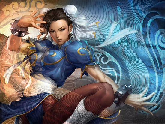
Stanley ArtGerm Lau

Stanley “Artgerm” Lau, one of the top artists on Deviantart.com with close to 9 million pageviews is also one of the founders of Imaginary Friends Studios, a concept art, comics and illustration studio that has worked on titles such as GI Joe, Batman, Justice League, Superman, Contra 4, NBA Street Basketball, Dungeons & Dragons, Powerpuff Girls, Call of Duty, DOTA, World of Warcraft, Warhammer, Soul Calibur 3 & 4, Street Fighter & Sleepy Hollow...


Saturday, January 22, 2011

Multiwindow Videos

Seems like everyone's doing them nowadays, but these two are pretty impressive!


Intel's 'The Chase' Multiwindow promo video


CMYKilla's Spoof Photoshop Tutorial Multiwindow Music Video
[VIA]

Sunday, July 25, 2010

Village in Ukraine

These photos are from the village in Ukraine, near Kiev.
Made by Alexander Mihailenko.

They are processed but still they depict the true spirit of old slavic village that still can be met in Ukraine.

Wednesday, June 9, 2010