Showing posts with label tutorial. Show all posts

Tuesday, March 8, 2011

The Cartoon Caveman At Work...

This past week at Sheridan College, two of my current 2nd Year students, Amir Avni and Mitch Kennedy, asked if I would do an on-camera demonstration of how I take a drawing from initial rough gesture through to the final sketch. It was all very spontaneous and we set up in the classroom right after I'd finished this week's lesson to their group. In a matter of minutes the camera was set up on the tripod looking down over my left shoulder and I started sketching away, keeping a stream of consciousness commentary going all the while I was working. Hopefully this will illustrate the ongoing thought process I experience as I am working out a drawing. By the way, I apologize for the initial stage where I am gesturing in quite lightly in blue pencil on the paper. What I didn't realize at the time was that it was just too light for the camera to pick up. However, once I start working out the basic forms on top of the scribbled gesture, you can make out more clearly what I am doing. As for the chosen subject matter, let's just say that there's nothing more appealing to me than doodling a cute gal!

Again, my sincere thanks to Amir and Mitch for coming up with this idea, as it really was quite fun to do and I am actually quite flattered that they asked me. Please be sure to also check out their blogs to see a sampling of what these clever students of mine can do themselves:

Amir Avni
Mitch Kennedy


The finished sketch. By the way, if this were an actual assignment, I would lay a fresh sheet of paper on top of this and refine the drawing much more before inking it.

What's My Line?

Again I am going to use John Kricfalusi's blog as a springboard to my topic today. John has been posting art notes that he'd written to hopefully ensure that the studios he was working with overseas would adhere to the correct design style of his show. You can read his post here. I believe what he is talking about in regard to linework relates to what I had also talked about in a Character Design class I gave just a couple of weeks ago to my Sheridan students. Since we rely on lines to a huge extent in cartoon art, the types of lines employed should actually mean something. To illustrate what I am getting at, here are the visual notes I drew for my class:

There really aren't many perfectly straight lines in nature - as they are mostly of human invention, found in machinery, architecture, etc. However, straight lines help to convey rigidity and firmness of form, whether something is absolutely solid or not. Straight lines also denote tension, such as the tautness of a rope pulled tightly, flesh stretched tight over the bone, or the creases in a freshly pressed suit and pants.

The 'C' curve travels in one direction and is mostly employed to show fullness of form. It can portray soft, pudgy flesh and the puffiness of fur. Anything that is inflated with air or bloated with liquid tends to round out into 'C' curves. The effect you can create when using them on humans or animals can also result in personality types that are friendly or comical. (Think of all of the rounded puffy forms on a circus clown, for example.)

The 'S' Curve is a curve that starts out in one direction then changes and curves in the other direction. This type of line is very prevalent in nature and is used to show rhythmic gracefulness of form. Animals that we consider very elegant in their structure, like cats and many types of birds, have flowing forms full of 'S' Curves. And of course an attractive female figure is loaded with them too! Many things in nature also move in 'S' Curve patterns, such as seaweed undulating with the current, a figure skater or ballet dancer, or a squirrel bounding up and down through the grass. A snake has to travel in 'S' Curves, its body pushing off from side to side through complex muscular contractions in order to propel itself forward.

From the examples above, I hope you can get a sense of what type of line will best suggest the desired form. Though I have deliberately used a preponderance of each individual type of line in the respective examples to exaggerate my point, a good drawing should ideally comprise a variety of linework stressing all three types of line. This not only helps to convey the correct form, but also creates visual variety, which is more pleasing to the viewer's eye, ultimately helping to engage their interest. This still of Shere Khan the tiger, from Disney's "The Jungle Book", has a nice variety of straight lines and curves that suggest exactly what the form is.

Here's an example from TV animation that still illustrates the principle of well-chosen lines to convey form. There are a few straight lines on Fred and Barney to show more of their ruggedness relative to their softer wives and round, chubby babies.

Unfortunately, many of today's cartoon shows fail to recognize the importance of line and tend to design everything with too many straight lines and sharp corners. Yes, I share John K's extreme distaste for this supposedly "stylistic" approach, as there really isn't anything clever or appealing about it in my view. Here's an example of what I mean:

This character has been created almost entirely from straight lines. Even his tongue! The result is that the character looks like he's been chiseled out of stone rather than made up of flesh, muscle and hair. The image ultimately has no sense of weight or volume and is merely a flat graphic design, and not a very good one either, considering the directionless arrangement of the lines in the hair for example. It certainly has not been designed for anything more than stiff, mechanical movement either, and this self limitation makes me long for the days when characters were designed specifically to work well in flowing, organic animation. Visually, it has all of the wit and appeal of a connect-the-dots puzzle in a kids' activity book! Sadly, we're seeing more and more witless design in today's TV animation. The tragedy is that it doesn't have to be this way, as there are countless individuals toiling away within the industry (and outside of it too) who are capable of far better design themselves. Why are they not being given a chance to shine? Why this rampant trend toward mediocrity?

A Disney Halloween!

In celebration of Halloween, I thought I'd post a couple of illustrations that I drew and painted about 3 years ago as part of a Disney Halloween book published by Random House, entitled "Don't Go Bump in the Night!" The book offered a series of safety tips to kids by utilizing various characters from both Disney and Pixar films to illustrate them in a fun way. This book can still be ordered here on Amazon.

In this painting of Snow White and the Seven Dwarfs, the point was to show kids how important it is to carry a flashlight in order to see your way in the dark. The characters were drawn on paper and inked traditionally with brush on a transparent sheet of mylar. The linework was then scanned in and coloured with Photoshop (including the outlines) on a layer that was created on top of the background painting that had also been scanned in beforehand. (Click on all images to see them larger.)

Here is the background art on its own. I try to paint each background in a style that matches the film itself. In this case, I was trying for a more delicate watercolour look, although I was actually using dilute layers of gouache to achieve the effect.

In this painting of The Lion King, the tip was regarding the recommended use of makeup instead of facemasks that might hinder one's eyesight. This was just a single page illustration, as opposed to the 2-page spread of Snow White above.

Again I was trying to match the background style of the film itself, this time using the gouache more full-strength as it was used in the actual film production. By the way, this hybrid approach of traditionally painted backgrounds combined with characters that are traditionally drawn and inked, yet coloured up in Photoshop, is about as much as I would want to involve the computer in my artwork. I do not personally care for the look of digitally painted backgrounds and I also prefer the tactility of real paint on a cold-pressed illustration board. For me, it is all about the aesthetic.

Unfortunately, I can't take credit for the cover of the book, as it was illustrated later by one of Disney's in-house artists, I believe. From what I recall, the design concept for the cover had not been finalized when I had first been sent the project.

Disney Turnarounds

A few weeks ago, John Kricfalusi wrote a very helpful post on using simple toys as a drawing aid for learning how to construct a character using basic forms and guidelines for placing surface details. Here is the post showing his example of a Top Cat construction drawing. Although I haven't used that officially as a lesson in my own Character Design class, I have actually given something similar in past years to individual students who are having trouble getting the hang of construction drawing. I'd hand out a sheet showing my sketches of a simple vinyl toy in several different angles. Hopefully, practicing that method of drawing on their own, the students could more quickly get up to speed with the rest of the class.

Interestingly, I have often had the opportunity to do the exact reverse of that process for many jobs in the past. I used to regularly create "Turnaround Drawings" of various Disney characters for the Disney Stores and Catalogue art department. Usually an artist there would provide a rough concept sketch of the character in the desired pose and I would then adapt that sketch into a series of 2 or 3 drawings depicting the character at different angles. These turnarounds would then be sent to the artist who would then sculpt the actual item in clay using the various views as a guide to maintaining the accuracy from all sides. I always enjoyed the challenge of trying to visualize the finished sculpture as I was working out these different views. One really has to "think" in 3 dimensions.


Usually, front and back 3/4 views are the best for showing the most visual information, but sometimes including an extra view or partial view is desirable to fill in some extra info, like the direct front view of Grumpy's head to show how the one eye is shut while the other is stretched wide in his skeptical expression. In addition to these turnarounds, the sculptor would normally receive some animation model sheet drawings that would help him further understand the character's structure. By hunting around a bit on Google, I was able to find this one image of the finished Pinocchio figurine ( a line called Big Figs" by Disney), though the view is certainly not the best to show off the character well. After I do these things, I'm never really sure if all of them do in fact get produced. Last year, however, I did see several I had worked on when I visited the Disney gallery in Downtown Disney at WDW in Florida. It was neat to see how they'd come out. Usually I feel that the sculptor, with the Disney art department's guidance, does a very nice job in maintaining what I was trying to portray in my turnarounds.


To help understand his profile, Disney had requested a third view of this White Rabbit pose. He was certainly an enjoyable figure to work on, being comprised of very rounded forms. In fact, you can see my construction lines still visible, like the round pear shape body and the small sphere for his cranium. These underlying construction lines would have been drawn in blue pencil in my original drawings, appearing as a light gray in these photocopies.

Incidentally, this post today is in response to a request made several weeks ago by my friend, Alvaro Cervantes. He is a brilliant sculptor himself with many years experience in toy design, both at Disney and other companies. Please check out his work by clicking on the link to his blog provided on the right.

Angry Girlfriend!

Here's a little drawing exercise I give out in my first week of teaching just to see what all of my 2nd Year students are currently capable of. They have to illustrate the following two character scenario:

A teen boy shows up late for a date with his girlfriend.

I tell them that I want to see an emphasis on good clear poses stressing line of action that would also read well in silhouette. I want them to devise entertaining expressions and body language that show what the characters are feeling, all of which should result in a clear visual statement in a single drawing that communicates to the viewer what's going on in the scene. And they have about 20 - 25 minutes to do it before I collect them up and then show them all on the overhead projector in a quick, lighthearted critique.

Since I can't let my students have all the fun, I also draw out the scenario myself during the same timeframe. Here are a couple of different possible approaches I came up with:

In this first sketch, the girl is looking quite defiant with arms folded and back turned on her hapless boyfriend who's trying desperately to plead his case. I like her withering glare!

In this second variation, the girl has taken a more aggressive stance, moving toward the poor guy who's backing away as she's really ripping into him.

In both drawings, I also took a number of quick glances toward my students who were busily producing their own variations, taking note of clothing, hairstyles and facial types that I could incorporate into my sketches. This is something I explained to them afterward, suggesting that they too should develop the good habit of taking visual notes in their sketchbooks on all that they see around them. Building up a reference library of character types, face shapes, fashion, etc, etc., will always result in much richer character designs in future assignments!

Continuing On From Last Lesson...

I'm still referring back to this post that John K. had on his blog last week that I expanded upon in my last post. I think there's a lot of good stuff in there that I'm sort of taking on as a personal challenge to see what I can come up with based on John's ideas on character design.

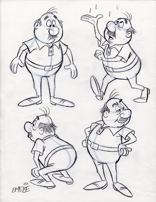
The little guy that I had drawn as a demonstration of simple cartoon construction in my last post is appealing enough I suppose, but his structure is limited to very basic spherical shapes: slightly distorted egg shapes for both his head and body. As I had mentioned, it was for a beginners' cartoon class, so that's why I kept it as simple to follow as I could, but it is admittedly a bit boring. My own personal taste dictates that there be more of a feeling of animation, especially the principle of "Squash and Stretch" that gives a character a more pliable and "organic" quality. On a chubby little guy like this particularly, it's good to imbue him with a feeling of loose flesh that reacts in actions and expressions. Additionally, I am trying to explore other design possibilities, which John covers as "Aesthetic", where you try to make the design more visually appealing by varying the types of lines and shapes, as well as relative lengths and widths of the many elements within the figure. So, in the case of this little guy, I tried distorting those original egg shapes, adding some straight planes and what we call 'S' curves to break up the monotony of what it had looked like before.

Along with this visual experimenting, I am also at this stage thinking of what sort of "Personality" type he might be, again going back to John's thoughts on what should be considered when creating a character design. In the original design, he was looking like a bit of a curmudgeon, sort of a similar type to Mr. Wilson in Hank Ketcham's "Dennis the Menace". In these new sketches I am trying different personalities on him, deciding whether I might want him to be worn out and tired, pompous and aloof, or a bit more silly and carefree. Well, here's where the sketches start to suggest something more specific...

The sketch on the righthand side of the exploratory concepts page recalled a guy I used to work with years ago named George. Just like the rough sketch, George always had a big easygoing smile, with an upper lip and mustache that jutted out above a lower lip that was swept back with a receding chin. He was a really funny and delightful guy, so I thought I would base my character on his personality and physical traits, though this is not meant to be a perfect likeness of him, but rather, just using George as a starting point for developing this guy in a specific direction.

The veteran Disney animator, Eric Larson, often noted how he based the persona of Figaro, the kitten in "Pinocchio", on that of his own little nephew. This little kid could be stubborn and prone to temper tantrums, so Eric imbued his character with similar mannerisms, resulting in a character "type" that the audience would likely be familiar with and thus could easily relate to. This approach of basing characters on either one or a combination of several people you've actually met in your life experiences can result in richer animated performances and designs that really communicate a specific idea, rather than just trying to invent something randomly from scratch.

So, in developing this character based on my old friend George, I tried to recall specific instances from when we worked together. One thing I remembered was how George used to enjoy going out for the occasional game of golf which was compliments of one of our longtime vendors in appreciation for the work thrown his way during the year. By George's own admission, he was a lousy golfer himself, but he was mostly looking forward to the free meal he'd get back at the clubhouse dining room! George was a wheeler-dealer who loved to barter for things rather than pay good money, therefore a free lunch was never turned down. Another fond recollection I have of George is his impromptu, hip-shakin' Elvis impersonations. Again, that's something colourful and fun that can be utilized in the traits of this character design. By the way, George may have had a middle aged paunch, but he was not as hefty as this character, so that is still a direct holdover from the original concept. This character could be taken further, exploring more visual possibilities before refining it into a final design, but since this is just for the sake of this demo, I'm going to leave it there.

Lastly, here is a page of rough poses I did of this dumb mutt many years ago. You'll note that this pooch ended up as my life model in the cartoon heading up my last post. Fortunately, the black eye he'd likely acquired in a doggy rumble seems to have healed up nicely since the rough sketch.

Cartoon Construction 101

This week I head back to teaching 2nd Year Animation Character Design at Sheridan College here in Ontario. As John Kricfalusi has just posted this very informative article regarding character design on his blog, I thought I might tie into what he is saying once again. This post deals with what John describes as the "Functional" aspect of the design process - just understanding how simple forms placed together in an appealing manner is the foundation that an animator/cartoonist starts out with initially.

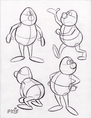
These drawings posted below are fairly simple, as they were done not for Sheridan students, but rather, for a more basic cartooning class I have taught informally at a couple local venues over the last several years. As such, they are not as "animated" as I usually prefer to draw, lacking a feel of "Squash and Stretch" that would give them more of an organic, pliable quality. But they serve the purpose of showing the concept of how to draw a simple constructed character in a variety of poses while maintaining consistency of form and proportion. Remember, this particular cartooning class included several students who were just beginners!

Here are the simple constructed forms, with guidelines to determine the tilt and angle of the head and body, as well as for consistent placement of all of the surface details. Though pictured in black line here for clarity, it is recommended you draw this stage lightly with a blue pencil in order to distinguish it from the finished outline and details you will be adding on top later.

Here is the finished character with all surface details added, and the light blue underdrawing still slightly visible so that you can see how it is done. As you can now see, those guidelines have helped in the accurate placement of his facial features, as well as the collar of his shirt and belt line too. Also notice how I've varied his expression and eye direction in order to create some personality and more visual interest. When drawing different tilts and angles of the forms, you also have to understand some of the basic rules of perspective in order to give the illusion of a solid form rotating in space while maintaining a consistent volume. Again, as John always tells beginning cartoonists, it's a good idea to learn what you can from the Preston Blair book, as that's quite honestly how most of we professionals learned in the beginning, back when we were young! Artistic styles may change over the years, but the fundamentals of good solid drawing do not.

PS: I dedicate today's post to young Chet, who was looking for some advice on how to construct a cartoon character. I hope this helps him out a bit.

If I Could Talk To The Animals

There's an interesting article on Michael Barrier's site that I think is worth checking out. His August 5th entry is a reprinting of a commentary by Ed Hooks regarding the approach taken to "Inter-species Communication" in Pixar's "Ratatouille". Here's Ed's first two paragraphs just to provide some context to what I'm about to discuss:

"One of the early and most important decisions Brad Bird had to make when he started working on the script for "Ratatouille" was what to do about inter-species communication. The star of the movie is a rat after all, and much of the supporting cast is human. If you have the rat speak out-loud English with any of the human characters, you will overly challenge the audience member's willingness to suspend his disbelief.

Inter-species communication is a fascinating challenge for animation. You can anthropomorphize inanimate things and animals all you want, but you have to be very careful about how you have them interact with one another, and especially with humans. In "Lion King", all of the animals had human traits and personalities, but they related only to one another. In "Finding Nemo", the fish never directly communicate with that human dentist. In "Lady and the Tramp", the animals talk to one another, but not to the humans. In "Cars", John Lasseter solved the problem by not having human drivers for the cars."


This is actually a topic that I've given a lot of thought to over the years, as I believe it's something that should be considered by anybody attempting to write stories /screenplays featuring animal characters. Back in 1997, the first year I taught Character Design at Sheridan College, I decided to put these observations down on paper in order to give the students something to keep in mind as they were developing animal characters that could be used in their films. Based upon all of the animated features, shorts and TV shows I'd absorbed over a lifetime of watching cartoons, I felt that one could distill the number of approaches into four main categories. This is not to imply that there are only these possibilities, by the way, as I've seen examples that are subsets of these categories, or may be oddball exceptions to all of my arbitrary rules!


For instance, there may even be more than one of these categories represented within a single film. An example of this would be in Disney's "Pinocchio". Figaro the kitten is representative of the first category, as he shows some humanlike emotion while remaining very much an animal as Geppetto's pet. But then you also have Honest John the fox and Gideon who, although also a cat, is totally unlike Figaro. These two rascals are very much representative of the fourth category, in that they walk upright, talk, wear clothes, and exhibit totally humanlike behavior. In addition, they would both be human size relative to Geppetto and the other human characters. As such, these two characters are visual metaphors for human "types", the fox in particular meant to be a caricature of one who is sly and untrustworthy. Because "Pinocchio" is such an abstract, allegorical story to begin with, mixing more than one category doesn't seem to be a problem. In films that are more mainstream in their stories, I think more care needs to be taken in order to keep things clear to the viewer. So please, just take this theorizing on my part for whatever it's worth. It's really just meant to give an idea of what may be considered as characters are developed in regard to, in the words of Ed Hooks, "Inter-species Communication". Much thanks to Michael Barrier for making me aware of Ed's article.

"Bland" Be Banned!

John Kricfalusi has another provocative topic regarding "bland" character designs that can be found in this recent post. For the record, though I admire John's knowledge of Hollywood cartoons greatly, I often respectfully disagree with his stance on the characters and stories in the Disney features, as I find he's too dismissive of a lot of wonderful art. However, I do see his point this time around in regards to the way kids are often designed in the Disney films. I'll admit there is a generic template that Disney has adhered to in many of their kid characters, with only minor variations in the facial types.

John has posted a bunch of photos of famous Hollywood kids from live-action films of that bygone era, which he rightly acknowledges as having more personality traits and physical variation than their animated film counterparts. Just for fun, I've decided to draw some quick caricatures of 6 of his photo examples in an attempt to show how these particular kids could be adapted as animatible cartoon characters, with an eye to exploring different head shapes and facial features to show distinction of character "types", as well as unique and interesting silhouettes. The likenesses are only so-so, by the way. What I'm really trying to do here is show how a character designer could start with photo reference of a specific "type" as a jumping off point to creating a design that communicates that particular personality to the audience. So here they are:


1) Beaver Cleaver - The All-American Boy: I've also added a baseball cap to this likeness to exaggerate his distinction as the cleancut kid that would make his Mom proud, despite his propensity to get into typical boyhood dilemmas. Physically, the Beav has downward sloping eyes, buck teeth, and a square face. His facial features suggest a trusting look that communicates his naivete and basic goodness.

2) Bobby Driscoll - The Mischievous Imp: Bobby has pixie-like features in his slanted up twinkling eyes, small pug nose, and devilish grin. His face shape and placement of features are a series of 'V' shapes. You just know this kid is up to some youthful prank, but you can't help but like him. In his teenage years, Bobby of course was the voice and model for Disney's "Peter Pan". Here then is where I would disagree with John's assessment in a previous post of Pan as being "generic" in design. Pan was a deliberate caricature of Bobby Driscoll and is therefore quite a "specific" type in my opinion.

3) Will Robinson - The Inquisitive Whiz Kid: His long face, vertically stretched facial design, and slight build suggest a kid that would rather read books and build model kits than go out and play sports. He is the typical "Brainiac", quite fluent in math and handy on the computer.

4) Alfalfa - The Gangly Casanova: He of course was the oddball, awkward looking stringbean among "The Little Rascals", with his stretched out, skinny physical build, big expressive eyes, and that cowlick that shot straight up like an antenna. Yet despite his physical ungainliness, he fancied himself a "Lady's Man", always ready to serenade some young cutie with his off-key singing. I'd suggest that Disney's "Ichabod Crane" is the adult equivalent of this character type.

5) Opie Taylor - The Bumpkin: With his goofy gap-toothed smile, tussled "Sheep Dog" red hair, and a generous helping of freckles, Opie is the kid that's just made for running barefoot through a pasture, climbing trees, and gnawing on a big slice of watermelon. No big city living for this small town boy.

6) Danny Partridge - The Conniving Schemer - (I had to find a different photo to work from to draw this guy) His face is wider horizontally than the others and his narrow, shifty eyes also follow across that side to side facial pattern. His mod, uncombed 70's era long hair communicates that "Rock Star" self-assured sleaziness. You know by looking at him that he's up to no good, trying to make a fast buck by hustling some poor unsuspecting schlemiel.

These drawings are by no means the only ways to portray these distinctively different kid "types". There are so many varied approaches one could take to accomplish the same goal. The key, though, is making a concerted effort to study real faces of kids in order to come up with more "specific" characters as John K is always trying to encourage. Otherwise, by just designing something out of your head with no research, you're likely to end up with the same "bland" or "generic" character designs that we've seen in countless animated features and TV shows. As my Sheridan Character Design students soon become aware of each year, I insist on them keeping a sketchpad and using it to record all of the wonderful array of character types they see all around them. Also, I prefer that they take a more "caricatured" approach to drawing people, as this is the best way to develop unique and interesting personality types through humourous exaggeration and visual shorthand. Again, I'd like to thank John Kricfalusi for this interesting topic as a springboard for me to expand on the theme here on my blog.

A Squirrel in the Rough

Here's a little character I've been playing with for awhile. I've had an idea for a story that's been kicking around in my noggin involving a squirrel and some birds. I'm hoping to develop it into a children's book. Anyway, this is the rough prototype for the rascal. (Actually, I think in several expressions he sort of looks like me!)

I'm posting these sketches as an example of what I am always suggesting to my Sheridan Animation students. That is, before finalizing a character design you should take it out for a "test drive" to see how it's working. A common mistake I've found is that a student will draw one or two views of a character and be instantly sold on it. I maintain that you should never nail down a character design until you've sketched it many times over, trying it out in various animated poses. Many's the time that I've found that a design that looked good to me initially proved to be awkward to move around into different poses. When that happens, always be prepared to make whatever modifications that may be necessary to make it work better.


In these 2 sets of sketches, I've just allowed my stream of consciousness to take over, doodling my squirrel in whatever pose and attitude that happens to flow out of my pencil naturally. None of these sketches are finished in any way and they may not even show him in altogether consistent proportions. In fact, sometimes I find that more ideal proportions may develop quite naturally through the repetition of drawing him out in different poses. Likewise, the facial features may evolve into a more appealing design through trying various moods and expressions, as well as tilts and angles of the head. Even my approach to construction is looser at this stage. To dwell too much on structure right away would be a hindrance to developing him as a little personality.


For me, this is what is most fun about drawing. I love to just do little rough sketches like these to get a performance on paper. Admittedly, I am much happier having made a career being a cartoonist in the print medium. The only way I would want to be involved in animation is if I could draw in this "organic", fully dimensional way that pleases me. I'm not much of a fan of today's flat, graphic styles, I'm afraid.

More Character Types


Here are a bunch more sketches drawn from video, like the ones I showcased on my Oct. 4th entry. The ones pictured above are all of guests who have appeared on the Charlie Rose interview show seen on PBS. The show's website features numerous archived clips that are just great to sketch from, since the interviews allow you to study the subject in medium close-up, moving just enough that you can get a good feel for the design of the face and body, as well as their personality. I deliberately have drawn guests who I am not familiar with, as the point of the exercise is to take an honest approach to seeing the "design" of a face, in the size, shape and relative placement of the facial features on various head shapes, without getting hung up on whether or not a good likeness has been achieved. These sketches can then later be used as a starting point in developing "Character Types" for your cartoons and animation designs.

Here are direct links to all of the clips I used, so you can see how I interpreted the video reference:
Alison Gopnik
Klaus Schwab
Yang Lan
Jack Ma
Annie Cohen-Solal
Tung Chee-Hwa


The montage above is just of various people I have sketched recently from TV, so unfortunately I can't link to any clips for you. But I post them in the hope that it will encourage some of my readers to try this method of sketching people from video reference while taking a more caricatured approach. Specifically, I offer these up as examples to my Sheridan students as being representative of what I will be looking for in your ongoing assignment that I'll be assessing at the end of the fall semester.

Sketching Character Reference

I put this post together to tie in with what I'll be starting to cover in my Character Design classes at Sheridan College this week. The topic is "Character Types", and these are a few samples I just sketched yesterday to illustrate what I'll be stressing in this subject. I'm a firm believer that an animated or illustrated character should aspire to be distinct as an individual - the visual design suggesting a certain personality through the physical face and body type. The character designer on an animated film should serve the same role as a casting director on a live-action production. Just as a casting director tries to cast an actor or actress who has a believable "look" for a particular role, so should the character designer be trying to create a character that visually suggests the personality to be portrayed in the film.

There is a tendency for the novice to simply design a character off the top of his head, without considering what physical aspects and personality traits seem to work well in combination together to communicate a clear visual statement to the audience. My view is that, before an artist can have any knowledgeable output, one must first have some informed input. Therefore, I strongly recommend sketching people in the world around you, either from life or, as is my preference, from studying various character types on video in order to build up a library from which to draw upon when designing a specific character. I prefer the latter way of working, as video provides a way of studying the subject in a completely controlled manner, allowing one to study the subject at one's leisure. It helps to see the subject in motion, which makes it easier to see the physical "design" of the face and body type in order to then exaggerate and abstract it. Additionally, seeing the subject in motion and displaying physical nuances through body language, expressions, vocal mannerisms, etc. makes the resulting sketches far more successful in capturing personality and inner life than one would likely achieve by working from a still photo image.

Anyway, here are some samples sketched from YouTube that hopefully will illustrate what I'm saying more clearly. It should be noted, however, that the goal of the sketches is not to come up with a perfect likeness of the subject, but rather to make an honest attempt at seeing a unique design in the face and body type and using that as a springboard for abstraction and caricature:


Here are the links to the YouTube videos I sketched these from:
Character #1 Character #2
Character #3 Character #4


Here are the links to these videos:
Character #1 Character #2
Character #3 Character #4

Ironically, the "tough guy" character I've sketched from the YouTube clip is an imagined personality suggested by the physical type, as the fellow in the video really comes across as a very friendly and gentle sort. But in animation and cartooning, perception can carry more weight than being literal to the subject. Remember, you're trying to put forward a visual impression that your audience will understand at a quick glance. When required, more subtlety can be developed though story and animated characterization as your film progresses.

Monday, March 7, 2011

Working Out The Likeness

A comment by Denise Letter on my previous post:
"Hello Peter, good drawings! Could you put some of the photos of these people up to compare and learn?"

A very good idea, Denise! First of all though, I must give the following disclaimer:

The fact is, working from still photos is not my preferred method for drawing caricatures. When I draw caricatures of celebrities I never use photos if I can avoid it, as I much prefer to sketch them from watching video. By seeing my subject in motion, I find that I get a better feel for their simple visual design without getting bogged down with extraneous details. Also, I am equally as interested in capturing their distinctive personality in addition to their physical likeness and this too is more easily achieved by seeing my subject in action. For me, video is my favourite medium to work from, even better than real life, as it is totally controllable in my ability to play over or pause on a single frame for studying something in depth. When I work from still photos, I must admit I can't guarantee a great likeness of the subject, as the best I can hope for is that the interpretation results in something fairly close to the reference photos provided. So, having said that, I now present for you the way I work when limited to still photo reference alone.

When I sketch my fellow NCN members, the resulting caricature is very much dependent on what sort of photo reference that member has provided. To be perfectly blunt, there are some members who I am unlikely to even attempt to draw because they have only posted a single photo to work from. I never draw from a single image, as it too limiting in its visual information. So the members I like to draw are the ones who have provided a variety of pics, showing different angles and some variation in natural expression. (I say "natural" because I don't like made up funny expressions, like tongues poking out, crossed eyes, etc.)

My first step is to download as many of the pics as I think may be helpful to draw from by placing them in a file folder. At this point I then open them all up on my computer desktop and just look at them for awhile, glancing from one pose to another in order to try and see the underlying "design" of the face. So now I'll use these three examples to attempt to explain my thought process in working out the caricatured likeness.

This "Wolverine" lookalike is Adam Pate. As I study the selection of photos Adam has provided, I first try to see the overall shape of his head and face. Adam has a very wide, blocky jaw structure and a sturdy neck. His head shape seems to taper in narrower at the top. I keep everything loose at this stage of my drawing, as I may need to go back and fine tune things as my drawing progresses. Next it's onto the facial features themselves.

The facial features should be analyzed in three different ways: 1) Their relative spacing and placement on the facial plane, 2) their relative size to each other, and 3) their distinctive shape.

My visual impression of Adam's face is that his features are close set along the vertical centre line of his face with plenty of open space for the wide jaw and chin. Size-wise, he seems to have a large nose, small eyes and narrow mouth in its relaxed state. When I study the shapes, his eyes are slanted up and narrow with small light coloured irises. His nose flares out at the bottom with prominent nostrils. The mouth is always the most flexible feature, so I based its shape specifically on his expression in the 4th photo. I like the way his eyebrows arch upward in some expressions, so I portrayed them that way. In fact, Adam's face is very much based on a series of angular, alternating 'V' shapes. Sometimes I like to mentally compare a subject's face to a famous celebrity I've drawn before, and in Adam's case I thought there were some similarities to Kevin Kline and also, strangely enough, the young Peter Ustinov!

My next subject is Ken Coogan, or "Coogy" as he goes by professionally. Coogy's got a long narrow head shape that is swept back in a convex facial plane as can be clearly determined from the profile in the 5th photo. Because of this, my impression is that his features are stretched along this vertical space with a small chin that is close set to a long thin neck. His longish nose keeps the eyes and mouth separated some distance from each other. His eyes are squinty and heavy-lidded when he smiles and he has prominent lips. The shapes of his eyes and mouth are based on more curving 'U' shapes that head in opposite directions from each other. There is a droopiness to his features. Again, like in Adam's face, I chose to portray Coogy's raised eyebrows that I see in some of his expressions. As I drew Coogy, I couldn't help but think that he has similar features to that of comedian Garry Shandling.

Finally we come to Angie Jordan. Some aspiring caricaturists are somewhat unsure of how to approach drawing the face of an attractive woman, yet one should not shy away from the challenge. Overall, Angie strikes me as having a very angular head and features, which are in great contrast to the softer, curvier features that are seen on Alison Gelbman at the top right corner of my previous montage. In determining Angie's head shape, I am more inclined to draw her in a 3/4 view so that I can play up her high cheekbones and angular jutting chin. Her nose also juts out from the facial plane, so I see the overall design of her face as being made up of "arrows" thrusting forward and slightly downward at a 45 degree angle, with bridge of nose, mouth and jawline all parallel to each other. I like the expressiveness of her eyes in the 3rd photo, so I play up that wide-eyed look, giving her a lot of white space around her irises. Her mouth stretches wide back to her cheeks when she smiles, with all of her flesh taut to the bone. With females, it's also fun to study how the hairstyle works with the design and framing of the face. Angie's hair is long and straight with an interesting tuft in front that hangs down towards her eyes.

Again, I must confess that I have no idea how much these caricatures may or may not capture the subjects, as I have never met my NCN colleagues in person to have formed a visual impression of them. If I had good video reference of these folks to sketch from, I would likely end up with somewhat different results. By the way, my Sheridan students will recall that I distinctly have instructed them to draw people for their sketchbook assignment either from life or from video, and NOT from still photos. Until you have experienced drawing people in a caricatured fashion from life, you will not be able to draw them from still photos with the necessary skill set required to make informed artistic choices. Believe me, even I feel hindered when drawing from photos and would far rather draw my NCN friends from real life in order to get a more accurate feel for what they're all about.

Variety Is The Key!


Back in the spring, I decided to join the National Caricaturist Network (NCN) in order to meet some of my talented colleagues online and hopefully raise my own profile out there in cyberspace. It's certainly been a fun and rewarding experience, and I'm glad to be getting to know such a great bunch of artists through the member forums. (Unfortunately, you have to be a member to read them, otherwise I'd direct you all there. Sorry!)

Anyway, one of my favourite areas in the forums is "The Firing Squad", where members can post a selection of photos of themselves as fodder for the rest of us to sketch from. It's quite fascinating to see the myriad of variations that result, with each artist interpreting the subject in their own individual way. At this point I have sketched over 50 of my colleagues and posted them in the forum, as it's a lot of fun and keeps me in practice with what I love to do. Here is just a random sampling of some of my fellow NCNers - I'll post some more over the next little while.

Fact is, I really enjoy drawing what people really look like. By that I mean, not just drawing the same generic, cookie-cutter face and body design over and over again, but instead really observing the individual "design" of each person's face and then trying to exaggerate and simplify it into something appealing, while hopefully capturing the essence of their personality as well. I thought it might be a good time to post a montage of these faces on my blog, as I am currently going to be teaching my Sheridan animation students all about "Character Types". In other words, designing a character that somehow communicates to your audience what he or she is all about through the face and body type, essentially doing the same thing in cartoon that a casting director is concerned with when selecting the most appropriate actor to fill a role in a live-action film.

During this first semester at Sheridan, my students are also required to keep an ongoing sketchbook of drawings of actual people they see, but caricaturing the features and bodies as if they were studies for potential animated film characters. I am of the strong belief that by studying what individuals look like, this will hopefully result in them producing character designs that are richer in personality as well as more visually interesting in their variety of shapes and sizes. By posting my own caricatured drawings of these NCN members, I'm hoping this will give my students a clearer understanding of what I am looking for and why. In upcoming posts I will discuss more of the thought process that goes into doing these.

Gouache Meets Photoshop

In my previous post I showed some sample illustrations from a couple of Disney books that were painted completely in the traditional method of paint on illustration board. However, just so you don't get the idea that I am totally against using Photoshop, here are some samples that employ a hybrid method that I like to use.


This illustration is from a book published a few years ago by Random House, entitled "Beauties in Bloom", which featured two spring themed stories, one featuring "Snow White" and the other, "Cinderella". This was the first in a series of seasonal books put out as part of the "Disney Princesses" program. Though I'm admittedly not keen on the packaging of the characters under the "Disney Princesses" banner, I do enjoy illustrating the classic characters in original new tales, rather than just retelling the film stories.


After my final pencil layouts of the pages have been approved by Disney, I then separate the elements of characters and backgrounds. I transfer the background drawing onto a sheet of illustration board using graphite paper and a photocopy of my drawing that I can trace over with a sharp hard pencil. Once the background image is on the board, I start out painting in the large areas such as sky and grass using dilute washes of gouache on the surface which has already been pre-moistened with water brushed on evenly with a large flat brush. Once the larger expanses are in, I can start building up the details of bushes, trees, and surface texture on the ground.

In the case of "Snow White", since the film's backgrounds were rendered in watercolour, I am using the gouache more dilute in order to approximate the look of real transparent watercolour. It's a bit of a cheat, but then I'm pretty sure that even the Disney artists used some opaque gouache in areas that needed lighter highlights over dark areas. Frankly, I've never been good at handling real watercolour, so I prefer to use gouache because I'm more comfortable with it. Once all of the backgrounds have been painted, then comes the rather tedious task of scanning them into Photoshop, usually in two or three sections because of the limited area on the scanner plate. I then have to reassemble them into single Photoshop files, which is often tricky due to some areas having scanned a bit darker or lighter than others, and therefore needing some adjustment.


With the backgrounds out of the way, I can then get to the characters. Working from my clean pencil layouts, I place a sheet of matte finish mylar film on top of each one and, using a very fine #00 watercolour brush, carefully ink each set of characters as delicately as I can in order to approximate the way they used to hand ink the old animation cels using a crowquill pen and ink. When these are all completed, I then scan in each sheet of character art, again sometimes having to reassemble any large character groupings that were too big to scan in one piece. (Fortunately, that doesn't happen often.)

At this point, each page of character line art has to be converted into a transparent layer in Photoshop. This is so that I can then colour the characters by "painting" on a second transparent layer below, thus resulting in an image that really does approximate an animation cel with solid flat colours beneath the clean ink lines. What's nice about this method too, is that I can very easily go over separate areas on the line layer to change the colours of the line to something that relates better to the area of colour they contain. This is also the way they used to ink the cels in the early Disney feature films. Usually I keep this part pretty basic; just brown lines to surround warm colours and dark blue lines for blues and greens. I do a bit of tonal modeling on the areas of colour, but I keep that real basic too, otherwise the characters start looking too much like plastic.

Once both backgrounds and character layers are in the computer, it is then a very easy and fun process of assembling them together for the final picture files. The benefit of working this way as well, is that if either Disney or the publisher require any changes to be made, it is not much problem to slightly shift or adjust the size or colour value of a character, without having to worry about the background. Finally, the real benefit for me is just sending the client a couple of CDs containing all of the page setups, instead of sending a bulky stack of original illustration boards by Fedex, which can be quite costly, as well as nerve racking, hoping they arrive safely.

Because I really enjoy trying to match the background painting style of the original film, here are a couple more examples of my Disney book work which show some variety in approach:


This is a scene from "Happy new Year, Pooh!", that I did as one of a series of "Winnie-The-Pooh" books for Reader's Digest. It was a book of the month type of thing, where each title related to something in each month of the year. I did three books in the series. I quite like working with the Pooh characters, as well as doing the looser pen, ink and watercolour backgrounds that the film employed to adhere more to the original Shepard book illustrations. These backgrounds are more like coloured drawings than true paintings, and therefore are easier for me.


Still, that doesn't mean I shy away from more painterly approaches, as I had fun trying to mimic the style of background artist, Eyvind Earle, in "Sleeping Beauty". Eyvind would paint in large, opaque, flat areas of colour, then build up the surface detail in multiple layers with his gouache. My paintings are a lot more basic than his, though, as he would create incredible textures and ornate design work in his film backgrounds. In June of 2007, I got to see the exhibit of original Disney animation art that was on show in Montreal (having first debuted in Paris). It was a real pleasure to be able to get up so close to some original Eyvind Earle backgrounds and analyze his approach in the brush work and order in which he would paint all of the elements. His gnarled, old tree trunks were incredible to behold. My simplistic "forgeries" pale in comparison, I'm afraid, but it sure is fun trying to paint in his style!

The Problematic Brush

As I mentioned previously, Adobe has not really understood the needs of those of us used to working with real paints and brushes. In all of the brushes that Photoshop CS3 comes with, there is not one that will give you the effect of real paint being brushed onto a board. Sadly, all that's available in the default selections are hard brushes to give solid flat colour, soft brushes that have diffused edges like an airbrush, and an assortment of textures that work like moving rubber stamps, not serving artists so much as providing a novelty for the crafts enthusiasts. (Sorry for my blunt opinion, but that's the way I see it.)

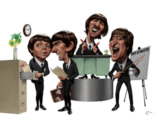
And so, I was rather delighted to find a custom brush that caricaturist Court Jones uses extensively in his art (like the sample pictured below of The Beatles) that he describes how to make in a tutorial he posted on the NCN forums some time ago. I've recreated it here to show what a neat effect it can give you:


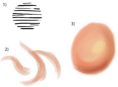
Step 1): Using the circle selection tool, fill a circle with a bunch of random, unevenly drawn horizontal lines drawn with a small hard round brush. Then, under "Edit", choose "Define Brush Preset". This will then add your new brush to the collection of existing Photoshop brushes. But it still needs some more work...

Step 2): In your brush settings, select "Brush Tip Shape". Then set the "Spacing" slider to between 15 and 20%.
Next, select "Shape Dynamics". Make sure that under "Size Jitter", the control is set to "Pen Pressure". Then, under "Angle Jitter", set the control to "Direction".
Finally, select "Other Dynamics" and make sure both controls are set to "Pen Pressure".

Don't forget to save it as a "New Brush Preset". Then, just for safety's sake, quit Photoshop and relaunch it. This will make sure that the brush is saved in the event of a crash.

Assuming you have made all these setting adjustments, the brushstroke thumbnail in the bottom of your brush settings should resemble the hairs of a round watercolour brush - soft horizontal lines that converge into tapered ends. Once you start making some marks with it, they should look like the samples here when at full 100% opacity and flow.

Step 3): When used at full strength, the brush strokes look a little harsh. But if you reduce the opacity to about 30% or less, you can start getting some nice creamy blends just like real paint. You also want to get in the habit of using the eyedropper tool to choose surrounding colours to further blend with, ending up with what looks like the sample I've sketched here.

Now, ideally, everything should be working well for you at this point and, with much experimenting and practise, you may be able to paint nearly as well Court Jones. Not an easy feat, I'll grant you :)

However, if you're using an iMac like me, you may run into a snag. I've found that this particular custom brush will sooner or later cause Photoshop to crash, leaving the message, "Photoshop has unexpectedly quit". Although, after it happens several times, it isn't so unexpected any more. The culprit, as I mentioned in the earlier post, is the "Direction" setting. I'm convinced that is what is problematic for the iMac, anyway. I've mentioned the problem to several Adobe tech support people but they all seem to play dumb, claiming that they've never heard of this happening before. Yeah, I'll bet.

And so, I continue to dislike virtual art media when compared to the real thing. Forever the traditionalist, that's me...

More Photoshop Frustration!

In addition to the problems I'd been having with the computer itself, I was also encountering a snag with Photoshop. As I mentioned in a recent post on how I'm hoping to learn some digital painting skills, I can't see it being very successful using only the default set of brushes. Unfortunately, I don't think that Adobe has ever really come to terms with the fact that much of their clientelle includes illustrators, not just photographers, and have really not created brushes that behave like natural sable or bristle brushes in order to satisfy our requirements. However, they have now opened things up a bit by allowing for artists to create "custom brushes", either by adjusting the settings of existing brushes, or creating something from scratch.

Not long ago, I had read on the forums of the National Caricaturist Network, a tutorial by the brilliant Court Jones (sample art shown at left), showing how to construct custom brushes in Photoshop that would behave similar to real brushes. I followed his directions to create one and, not long after starting to use it, Photoshop just crashed, disappearing and leaving the message, "Photoshop has unexpectedly quit". Several attempts later and it was causing Photoshop to crash every time. Many phone calls to Adobe did not help to resolve the problem, and they were convinced it couldn't be their program, that it must be my computer. I might have believed that, were it not for the fact that the same thing has happened on the iMac that was having the power problem (as detailed in last post), the new iMac Apple gave me in exchange, and also the 24" model that I insisted on upgrading to. Therefore, the glitch is in Photoshop itself, or at least something that is incompatible with the iMac.

My Google search into the matter turned up some interesting discussions on various creative forums, though. Seems that many graphic artists who have experienced the same problem have come to the conclusion that the trouble lies with the setting of "Direction" under the "Shape Dynamics" function. This setting is essential for enabling the virtual "hairs" of the brush to follow in the direction that you move the stylus. Seems that this is problematic on a lot of computers, causing some conflict between software and hardware, resulting in a crash at some point. I find it very frustrating, and it also reinforces my personal belief that virtual media is still no match for real brushes and paint! Fact is, I haven't yet been able to totally control making even a simple, smooth line using Photoshop. Yet it is a simple matter for me to create a line with real brush and ink that is a thing of great beauty. Why should I have to fight with percentages of opacity, flow, brush size and pen pressure settings in order to do what I can so easily accomplish through intuitive pressure and angling of a well crafted Winsor & Newton sable brush?

However, one good thing that has come out of all of my exploration was finding a tutorial on how to make a custom brush that feels pretty much like a nice soft pencil for sketching with. I found this great little tip on the blog of concept artist/designer, Paul Lasaine. All it involves is taking one of the default brushes and tweaking the settings a bit to make something more practical for the artist. I've tried using Sketchbook Pro on a friend's computer, and this custom brush created on Photoshop feels much the same as the Sketchbook ones, as I recall.

These are a couple of Photoshop doodles I just did to play with this virtual pencil. There is a nice freedom to using this modified brush and I can see myself getting some good use out it. These two samples started out as sketches directly using the new brush, then adding a layer on top, selecting the "Multiply" feature, then adding colour just using the soft round brushes full strength and going back to blend some areas with some gentle airbrushing. They look similar to the results I would achieve if using coloured markers on a photocopied pencil sketch. Great for visual concepts, if nothing else, although I don't want to rule out this approach even for a fresh looking piece of final art.

Photoshop Frustration!

I must admit, I'm still pretty leery of digital artwork. Up to this point, all of my artwork generated on the Mac has been of the hybrid sort: drawn and inked traditionally by hand, then scanned in and coloured up with Photoshop. Notice I said "coloured" as opposed to "painted". You see, I don't consider what I've achieved thus far to be digital paintings - at least not in the truest sense.

Here's a recent example which explains why not. This actually just started out as a test to see if I could create something using the Paths function on Photoshop. Frankly, I've never been able to figure out how to use that nefarious Pen tool, with it's Bezier Curves function. Being a right-brained kind of guy, I just couldn't make sense of those weird little handles. However, one of my students this year at Sheridan, Lawrence Lam, was kind enough to give me a basic tutorial on the different aspects of the Pen tool. I hadn't been practicing since then (about March), so it took a lot of messing around with it a couple days ago to figure it all out again. Fact is, it took me several hours to achieve what l did, so I'm going to have to work with this a lot more to get up to speed!


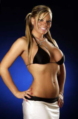
First of all, I needed some subject matter to practice on. Let's see now, what should I draw? Hmmm...hey, how about a CUTE GIRL! Fortunately, I'd been downloading pics of The Toronto Sun's daily "Sunshine Girl" for just such an occasion, so I had quite a collection to draw from. Though these pics are all relatively small, I wasn't in great need of visual clarity, as I am not attempting to achieve a perfect caricatured likeness of a specific girl. Anyway, I liked the sunny look of this cute blonde with her ponytails, plus the pose was appealing, so I went with her.


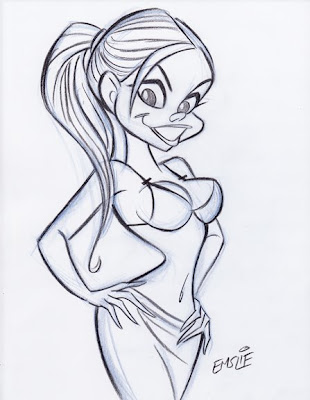
So here is my pencil sketch, starting out with a rough blue underdrawing, then defined on top with a dark pencil outline. (Are you paying attention, Sheridan students?) Like I said, I'm not trying to get a true likeness of this girl like I would with my celebrity caricatures - I'm just trying to capture her essence and using her pose and facial type as a starting point for what will be a much more cartooned interpretation. You can see how I've pushed the pose more, exaggerating the tilts and angles. For some reason, I have no idea why, I just gave her a single ponytail in the back instead of the two that the model has. Anyway, I only spent less than 20 minutes on the drawing, as it really was just for the purpose of this test with the Paths tool.


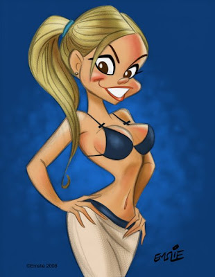
So after creating individual Paths for her flesh, hair, skirt, top, lips, eyes, etc. etc., I was finally ready to start adding colour. Initially I just filled each area with flat colours using the Paint Bucket tool, then started some fairly simple rendering in each area. I did want to try to get away from just using the Airbrush tool, so I used a custom brush that I learned how to make from an online tutorial that gave a more textured sort of rendering, similar to pastel. That, plus some softening here and there with the Airbrush seemed to result in a piece that was fairly appealing. I kept my pencil sketch on a transparent layer on top, lowering the opacity of the linework so it didn't overpower the colour. However, here's where I feel rather handicapped by my minimal knowledge of Photoshop and digital painting.


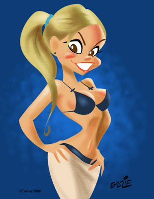
Here is the same artwork with the pencil sketch layer turned off so that just the colour is visible. As you can well see, it doesn't work like this, as it needs the pencil line to pull it all together. Ideally though, I would like to develop my Photoshop skills enough to attempt a real digital painting, using just tonal rendering to create the form, though perhaps using a bit of accent linework to strengthen it here and there. Recently, I've joined the National Caricaturist's Network (NCN), and have been studying the wonderful work of such talented folks as Joe Bluhm, Court Jones and Paul Moyse, just to mention a few. All of these guys are exceptional talents working with both digital and traditional media, but it's their digital work that I'm really trying to learn from. These guys are truly digital "painters" in the very real sense - something that I currently can only aspire to. If anyone can recommend any good sites for simple and clear Photoshop painting tutorials, please feel free to post them here in the comments section. Thanks!